Unlock a world of possibilities! Login now and discover the exclusive benefits awaiting you.
- Qlik Community
- :
- Forums
- :
- Analytics
- :
- App Development
- :
- Re: Qlik Sense Process Control Charts
- Subscribe to RSS Feed
- Mark Topic as New
- Mark Topic as Read
- Float this Topic for Current User
- Bookmark
- Subscribe
- Mute
- Printer Friendly Page
- Mark as New
- Bookmark
- Subscribe
- Mute
- Subscribe to RSS Feed
- Permalink
- Report Inappropriate Content
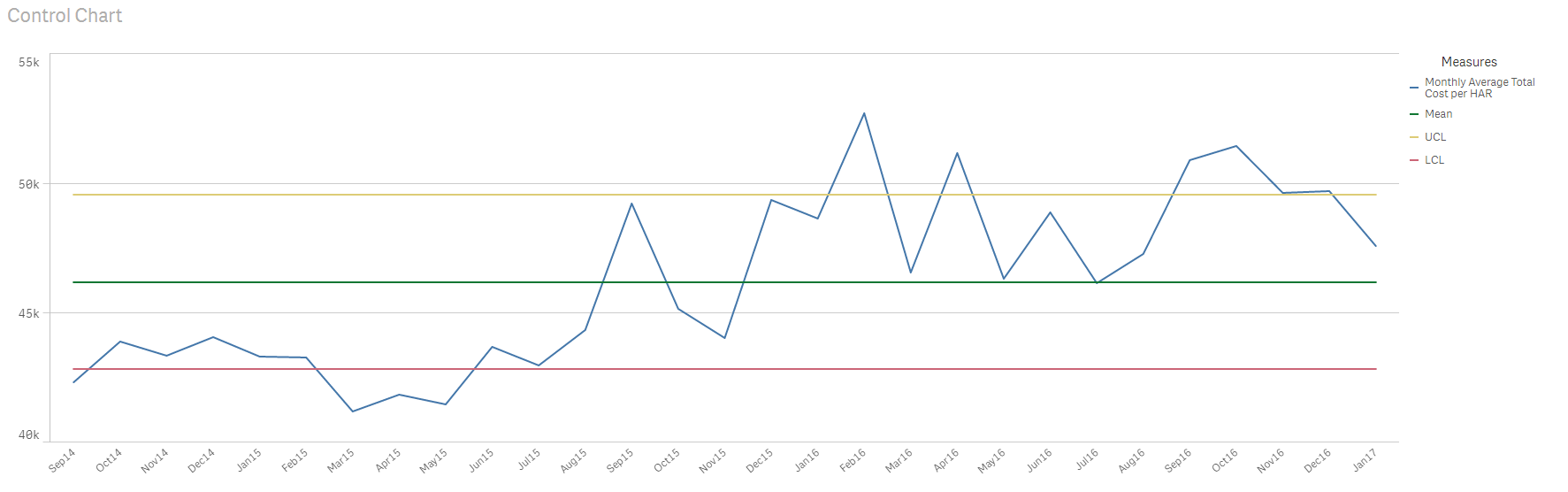
Qlik Sense Process Control Charts
Has anyone had any luck implementing a process control chart in Qlik Sense? Due to the limited control in the chart setup, I don't think a fully functioning and visual control chart can be created.
What works:
The calculations for avg, avg across all points, stdev, UCL and LCL.
Challenges:
- With each line as a measure, we can't control the color of the individual lines
- Similarly, it's not possible to conditionally color dots for a single measure to show outliers
- One way to control the color of each line is to change the measures to an inline table of dimensions and then control the colors based on an expression. The downside here is that Sense will no longer show the legend so we'd have to create a separate image object to act as a legend
Below is my best attempt so far, but it still has the challenges listed above. Anyone have any thoughts or suggestions? I'm considering just building an extension in its place, but wanted to make sure I explored all other possible opportunities.
- Mark as New
- Bookmark
- Subscribe
- Mute
- Subscribe to RSS Feed
- Permalink
- Report Inappropriate Content
As far as I know you are right with your assuptions. I would love to see an extension to build control charts and I think it is a good idea. I couldn't find any project on Branch that has done what you intend to do...
- Mark as New
- Bookmark
- Subscribe
- Mute
- Subscribe to RSS Feed
- Permalink
- Report Inappropriate Content
HI Petter, See my post below regarding a Qlik Sense Control Chart extension we have released.
- Mark as New
- Bookmark
- Subscribe
- Mute
- Subscribe to RSS Feed
- Permalink
- Report Inappropriate Content
We have released a Control Chart extension for Qlik Sense. More information and a 60 day trial can be downloaded from here.
Key features include: • Outliers Highlighted • Runs ‘above’ and ‘below’ the average highlighted • Trends up and down highlighted • Moving average based on Runs and/ or Trend triggers
Key configuration options include: • Customise Labels for Dimensions, Measures and Rules • Customise Line and point style for Dimensions, Measures and Rules • Pick the number of points to set the highlighting criteria for both Runs and Trends
For more information email: extensions@acumenbi.co.nz .