Unlock a world of possibilities! Login now and discover the exclusive benefits awaiting you.
- Qlik Community
- :
- All Forums
- :
- QlikView App Dev
- :
- A problem that needs solving
- Subscribe to RSS Feed
- Mark Topic as New
- Mark Topic as Read
- Float this Topic for Current User
- Bookmark
- Subscribe
- Mute
- Printer Friendly Page
- Mark as New
- Bookmark
- Subscribe
- Mute
- Subscribe to RSS Feed
- Permalink
- Report Inappropriate Content
A problem that needs solving
How do I create a trend line showing the year the policy was created for each sector of the line of business.
I have created a graph in the sales growth tab but for the life of me am not able to get it to show what I am asking above.
If any can provide a help, I would greatly appreciate it.
- Tags:
- new_to_qlikview
- Mark as New
- Bookmark
- Subscribe
- Mute
- Subscribe to RSS Feed
- Permalink
- Report Inappropriate Content
Hi Stephen, if you add Line of Business as second dimension doesn't give you the desired result?
Wich results are you expecting?
- Mark as New
- Bookmark
- Subscribe
- Mute
- Subscribe to RSS Feed
- Permalink
- Report Inappropriate Content
Hi Ruben,
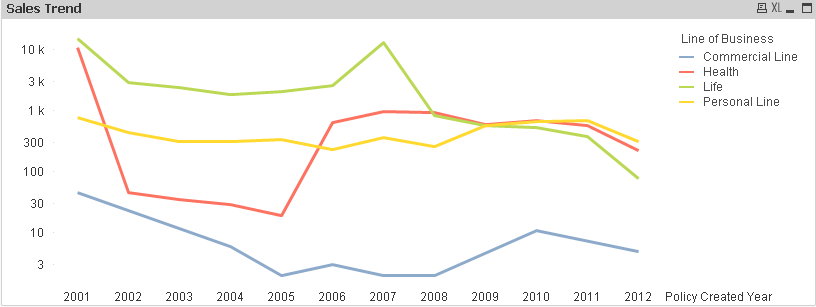
What i planned to show was trend line for the years 2001, 2002 etc for each of the 4 lines of business, health, commercial etc. So my line graph should show 4 different trend lines for each of the years. I have been trying to do this for ages, it is really frustrating me and as I am new to qlikview I dont know if this is possible. If this is not possible could you suggest something else.
Thanks,
Stephen
- Mark as New
- Bookmark
- Subscribe
- Mute
- Subscribe to RSS Feed
- Permalink
- Report Inappropriate Content
Hi, if I understand it right you only need to add Line of Business as dimension, please check attachment
- Mark as New
- Bookmark
- Subscribe
- Mute
- Subscribe to RSS Feed
- Permalink
- Report Inappropriate Content
If you do what Ruben says it´s working. You will have a trend line for each line of business
- Mark as New
- Bookmark
- Subscribe
- Mute
- Subscribe to RSS Feed
- Permalink
- Report Inappropriate Content
Thanks for your help, Rubin. That works but visually it has not turned out like I envisaged as the difference between the greatest line of business and the smallest line of business is a big amount. Is there any way i can make this information more visually appealing.
Thanks,
Stephen
- Mark as New
- Bookmark
- Subscribe
- Mute
- Subscribe to RSS Feed
- Permalink
- Report Inappropriate Content
It's difficult when there are a big difference between one business line and others, maybe in axis tab checking logarithm scale but those graphs are hard to read.
- Mark as New
- Bookmark
- Subscribe
- Mute
- Subscribe to RSS Feed
- Permalink
- Report Inappropriate Content
Thanks Ruben