Unlock a world of possibilities! Login now and discover the exclusive benefits awaiting you.
- Qlik Community
- :
- All Forums
- :
- QlikView App Dev
- :
- Adding Data Bar to Straight Table
- Subscribe to RSS Feed
- Mark Topic as New
- Mark Topic as Read
- Float this Topic for Current User
- Bookmark
- Subscribe
- Mute
- Printer Friendly Page
- Mark as New
- Bookmark
- Subscribe
- Mute
- Subscribe to RSS Feed
- Permalink
- Report Inappropriate Content
Adding Data Bar to Straight Table
In an Excel Pivot Table I have added conditional formatting "Data Bar" to the data to make it look like the following:
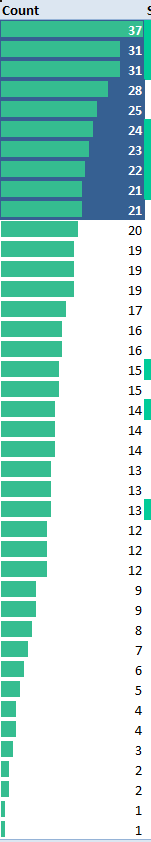
Is there a way to add this type of data graph to straight table cells?
- Mark as New
- Bookmark
- Subscribe
- Mute
- Subscribe to RSS Feed
- Permalink
- Report Inappropriate Content
- Create a table via the Chart functions option (not a normal table but a chart table)
- Create a expression to obtain the data as required.
- Then on the Expressions Tab.....
- Display Options - select Linear Guage
Then you will see a guage settings option button. YOu should be able to test with the various settings to get what you want here.
- Mark as New
- Bookmark
- Subscribe
- Mute
- Subscribe to RSS Feed
- Permalink
- Report Inappropriate Content
hamishimrie,
This was something new that I learned but I need it to make a gauge based on the other values in the column cells. The values in the column are based on an expression sum(YTDPremium). I only see in the gauge settings that I can set the segment limits.