Unlock a world of possibilities! Login now and discover the exclusive benefits awaiting you.
Announcements
FLASH SALE: Save $500! Use code FLASH2026 at checkout until Feb 14th at 11:59PM ET. Register Now!
- Qlik Community
- :
- All Forums
- :
- QlikView App Dev
- :
- Alternative Radar Chart
Options
- Subscribe to RSS Feed
- Mark Topic as New
- Mark Topic as Read
- Float this Topic for Current User
- Bookmark
- Subscribe
- Mute
- Printer Friendly Page
Turn on suggestions
Auto-suggest helps you quickly narrow down your search results by suggesting possible matches as you type.
Showing results for
Partner - Creator III
2017-10-25
07:22 AM
- Mark as New
- Bookmark
- Subscribe
- Mute
- Subscribe to RSS Feed
- Permalink
- Report Inappropriate Content
Alternative Radar Chart
Hi all,
I came across a requirement where a client wants to see hourly data represented in a clock format. At the minute, I'm using a series of Radar charts (13 in total) layered over each other to achieve the desired effect (below).
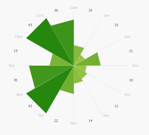
Unfortunately, this isn't a very elegant approach and slows the application down slightly. Does anyone here know of a way to achieve the above visualization in a single chart? The reason I didn't use a single radar is because that won't keep hours in separate segments (i.e. all lines are joined).
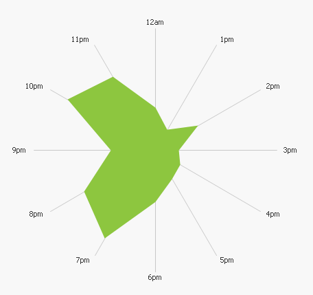
Here is what a single radar chart looks like:
1,544 Views
0 Replies