Unlock a world of possibilities! Login now and discover the exclusive benefits awaiting you.
- Qlik Community
- :
- All Forums
- :
- QlikView App Dev
- :
- Re: Analysis of Correlation with Matrix Diagram
- Subscribe to RSS Feed
- Mark Topic as New
- Mark Topic as Read
- Float this Topic for Current User
- Bookmark
- Subscribe
- Mute
- Printer Friendly Page
- Mark as New
- Bookmark
- Subscribe
- Mute
- Subscribe to RSS Feed
- Permalink
- Report Inappropriate Content
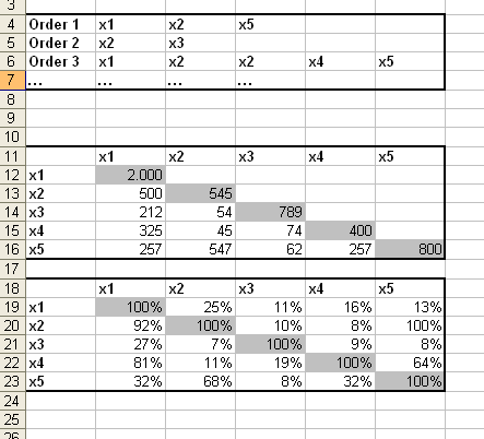
Analysis with Diagram
Hello everbody,
i have the following problem:
My data is sorted into different orders which contain various binary attributes.
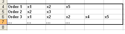
I want to display the data in a graphic which shows the corrleations of single attributes to other single attributes.
The size of the Bubble should be a measurement for correlation. The problem is, that i have the same axe in one diagram twice.
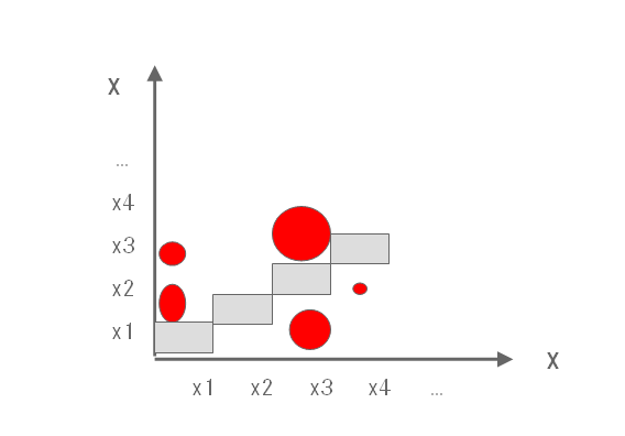
I tried it with the Matrixdiagram and the Pointdiagram.
The Problem of the Pointdiagram is that its axes are formulas and I am not able to categorize to the specific attributes.
The Pointdiagram looks pretty fine, but im not able to insert the same dimension twice.
It would be very nice if you can give me any hints or tipps or just the side of the manual 
Down is displayed the logic for the correlation:
- « Previous Replies
-
- 1
- 2
- Next Replies »
- Mark as New
- Bookmark
- Subscribe
- Mute
- Subscribe to RSS Feed
- Permalink
- Report Inappropriate Content
Sodele,
=if(SACode<>SACode5,
count(aggr(NODISTINCT if(ProdNummer=%ProdNummer5,1),ProdNummer,%ProdNummer5)) / count(ProdNummer)
)
- Mark as New
- Bookmark
- Subscribe
- Mute
- Subscribe to RSS Feed
- Permalink
- Report Inappropriate Content
Thank you very much for your fast answers Stefan 😃
- « Previous Replies
-
- 1
- 2
- Next Replies »