Unlock a world of possibilities! Login now and discover the exclusive benefits awaiting you.
- Qlik Community
- :
- All Forums
- :
- QlikView App Dev
- :
- Axis Label Rows
- Subscribe to RSS Feed
- Mark Topic as New
- Mark Topic as Read
- Float this Topic for Current User
- Bookmark
- Subscribe
- Mute
- Printer Friendly Page
- Mark as New
- Bookmark
- Subscribe
- Mute
- Subscribe to RSS Feed
- Permalink
- Report Inappropriate Content
Axis Label Rows
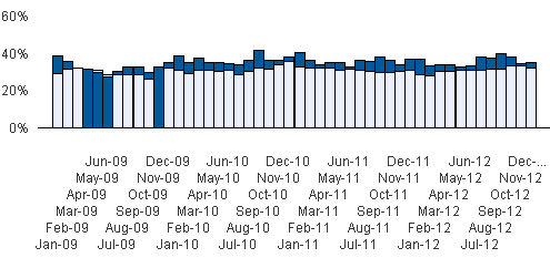
I have a chart that has a lot of axis labels (Every month between 2009 and 2012). I want the axis labels to be horizontal, but the labels are stacking up into 6 rows (see attached screenshot "axis rows") because obviously it can't fit it into a few lines. However, is there a way that I can make the axis labels fit into two rows, even if they overlap and become a blur of black lines (see screenshot 2). I'd rather they be a blur that is about 2 rows high, than all spread out and 6 rows high. I don't mind the blur of lines because eventually users will highlight and zoom in on the bars to view the data.
- Mark as New
- Bookmark
- Subscribe
- Mute
- Subscribe to RSS Feed
- Permalink
- Report Inappropriate Content
I believe you can only control staggered labels or not staggered labels in axis tab (i.e. not the number of levels / lines).
But if I may suggest another option, try using a vertical or diagonal axis label (check option '|' or '/' for primary dimension labels).