Unlock a world of possibilities! Login now and discover the exclusive benefits awaiting you.
- Qlik Community
- :
- All Forums
- :
- QlikView App Dev
- :
- Bar Chart Approaches Question
- Subscribe to RSS Feed
- Mark Topic as New
- Mark Topic as Read
- Float this Topic for Current User
- Bookmark
- Subscribe
- Mute
- Printer Friendly Page
- Mark as New
- Bookmark
- Subscribe
- Mute
- Subscribe to RSS Feed
- Permalink
- Report Inappropriate Content
Bar Chart Approaches Question
Hi Team,
I am new to Qlikview , Ia m attaching my QVW and also the Queries written in the QVW . I am unbale to Figure out some of the Functionalities in Qlikview in which i require your experise .
I am listing Few Questions regarding the BAr graph charts .
Q1 - >In The SKU Master Sheet I have two representions in SKU MASTER FEED GRAPH . My requirement is when i click on the red graph i should see only values related to that Item. How ever here im unable to traverse based on selection .
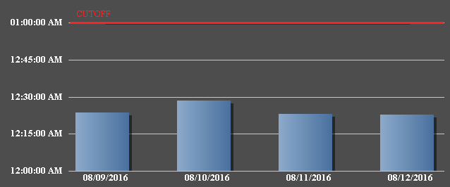
Q2-> Coming to SKU Mapping Sheet . Refer any graph .I have values popped till Today date when i executed the Query in Oracle, but Today's date is not displayed in Graph for some reason but graph is getting plotted . help me here i tried many approaches.
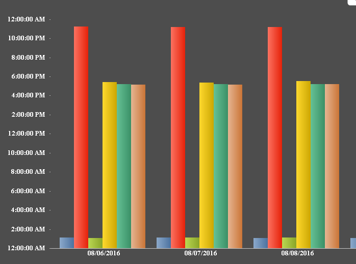
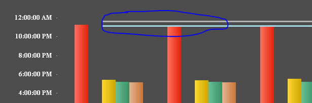
Q3-> Coming to Inbounds . If we look on cahrt on Y Axis the values has to be controlled by me which mean it shows timings of its wish till 4:00 AM of next day more than 24 hrs . I dont know how control those even after using control in Axes tab using Static step, can us sugest here .
Q->4 Coming to Inbounds . I have 8-9 to be represented in Graph and 8-9 Thresholds . but all of them are not getting plotted i put setanalysis to filterr if u look at my expressions . How can i make sure all of the are plotted . can u suggest any better approach.
Q->5 Another Question right now i am pulling data for 1 week , But i want data of 3 months to be pulled in Qlikview and only recent 7 days to be represented in Bar chart . How better i can acheieve this . Kindly suggest
Final Question can you suggest if this the better approach how i better can represtn these stuff apart from this wholistic approach .
- Mark as New
- Bookmark
- Subscribe
- Mute
- Subscribe to RSS Feed
- Permalink
- Report Inappropriate Content
Might not have answers to all of them, but I can start with Q2. I see 8/12/2016 on the chart (which is today, right? unless you are sitting in the other part of the world where 8/13 has started already)
- Mark as New
- Bookmark
- Subscribe
- Mute
- Subscribe to RSS Feed
- Permalink
- Report Inappropriate Content
Q1 Remove 1 from your expression so that selections can take effect
Max({1<SOURCE={PHWEB}>} SKU_INTIME)

- Mark as New
- Bookmark
- Subscribe
- Mute
- Subscribe to RSS Feed
- Permalink
- Report Inappropriate Content
Q3
Try a static max expression -> Interval#(25, 'h')
- Mark as New
- Bookmark
- Subscribe
- Mute
- Subscribe to RSS Feed
- Permalink
- Report Inappropriate Content
Q4
Are you looking for lines not plotting?
You need to fix your expressions:
SIQP
Max({1<INBOUND_SOURCE = {SIQP}>} INBOUND_INTIME)
CORONAREQUEST (There is a space between Corona and request)
Max({1<INBOUND_SOURCE={'CORONA REQUEST'}>} INBOUND_INTIME)
CUSTOMERFALLOUT (There is a space between Customer and Fallout)
Max({1<INBOUND_SOURCE={'CUSTOMER FALLOUT'}>} INBOUND_INTIME)
- Mark as New
- Bookmark
- Subscribe
- Mute
- Subscribe to RSS Feed
- Permalink
- Report Inappropriate Content
Q5
Use Set Analysis, or add a trigger to select latest one week of data when the dashboard is open. All depends on how you want to see this data
- Mark as New
- Bookmark
- Subscribe
- Mute
- Subscribe to RSS Feed
- Permalink
- Report Inappropriate Content
Hi Sunny ,
Thanks for that , But my requireemnt is , I f i clikc on the Red bar which is for PHWEB . I need only PHWEB graphs to be displayed , vice versa if i clikc on any GYPSY bar only gyspy geaphs for all dates to be dispalyed .
the one ealier u suggested was to remove 1 which is showing on for the particular date and removing all.