Unlock a world of possibilities! Login now and discover the exclusive benefits awaiting you.
- Qlik Community
- :
- All Forums
- :
- QlikView App Dev
- :
- Bar chart help please
- Subscribe to RSS Feed
- Mark Topic as New
- Mark Topic as Read
- Float this Topic for Current User
- Bookmark
- Subscribe
- Mute
- Printer Friendly Page
- Mark as New
- Bookmark
- Subscribe
- Mute
- Subscribe to RSS Feed
- Permalink
- Report Inappropriate Content
Bar chart help please
Hi QlikView gurus,
I need to take the following data and represent it as a bar chart where an Avg between "LCL" and "UCL" is represented as green, an Avg between "LSL" and "LCL" or "UCL" and "USL" is represented in yellow, and an Avg that is out of range is represented in red. I probably need to take another QlikView class, because I don't think that this should be as difficult for me as it is. Please help!

- « Previous Replies
-
- 1
- 2
- Next Replies »
Accepted Solutions
- Mark as New
- Bookmark
- Subscribe
- Mute
- Subscribe to RSS Feed
- Permalink
- Report Inappropriate Content
Hi Lee, I need more info to know what are you trying to distribute in each bar, records? days?... what is avg?
Assuming that this is counting records and avg is just the ActualNumeric field, I attach a version using mekko chart - the width of each bar can tell you how many records has any line -, If you need a bar chart or some other calculation formula, please provide more info about the requisites.
- Mark as New
- Bookmark
- Subscribe
- Mute
- Subscribe to RSS Feed
- Permalink
- Report Inappropriate Content
Are we trying to implement this on the chart on SPC Analysis tab?
- Mark as New
- Bookmark
- Subscribe
- Mute
- Subscribe to RSS Feed
- Permalink
- Report Inappropriate Content
Hi Lee, I need more info to know what are you trying to distribute in each bar, records? days?... what is avg?
Assuming that this is counting records and avg is just the ActualNumeric field, I attach a version using mekko chart - the width of each bar can tell you how many records has any line -, If you need a bar chart or some other calculation formula, please provide more info about the requisites.
- Mark as New
- Bookmark
- Subscribe
- Mute
- Subscribe to RSS Feed
- Permalink
- Report Inappropriate Content
Yes - on the SPC Analysis tab.
- Mark as New
- Bookmark
- Subscribe
- Mute
- Subscribe to RSS Feed
- Permalink
- Report Inappropriate Content
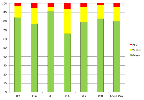
I'm having trouble with my anti-malware software not allowing me to download qvw files from this site. I'm trying to fix the problem, but I haven't been able to open your qvw yet. The avg is a measurement for different tests that are conducted throughout the day. I basically just need to represent the count. In the below example, the test for Package Weight was higher than the USL all but once. So the chart for this range would show zero in the green zone, 1 in the yellow zone, and 15 in the red zone. I should probably also create one that presents the data in percentages.

I hope that was understandable. thank you again for your help!
- Mark as New
- Bookmark
- Subscribe
- Mute
- Subscribe to RSS Feed
- Permalink
- Report Inappropriate Content
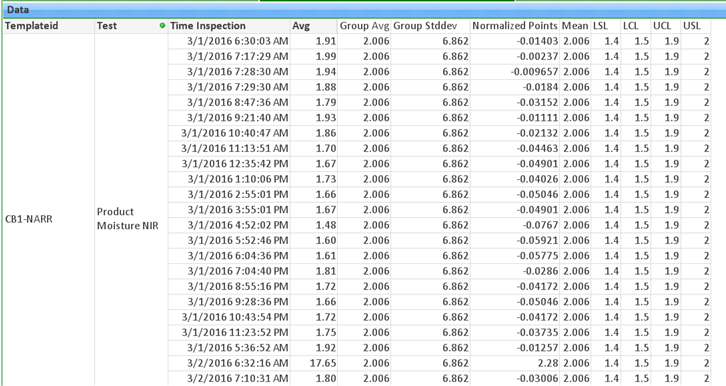
I was able to download the file. That was a big help - thanks! I'm curious about something else. The "TimeInspection" column in the chart is sorted daily midnight through 11:59 pm. Is there a way to sort that column so that every day appears as 6:00 am through 5:59 am instead?
- Mark as New
- Bookmark
- Subscribe
- Mute
- Subscribe to RSS Feed
- Permalink
- Report Inappropriate Content
Hi Lee, that will be kind of weird, isn't? ie:
| TimeInspection |
|---|
| 01/01/2016 6:00 am |
| 01/01/2016 14:00 pm |
| 01/01/2016 04:00 am |
| 02/01/2016 6:00 am |
Note the 26 hours gap between the last 2 rows, you want your dates sorted like this? If that's the requirement you can sort TimeInspection by expression in 'Sort' tab, using this expression:
If(frac(Time(Timeinspection))<1/24*6, Timeinspection+1/24*18, Timeinspection-1/24*6)
Btw, my expressions in last posts were wrong, I switched the fields. It's corrected in this post: Re: Calculated percentage in Bar Chart
- Mark as New
- Bookmark
- Subscribe
- Mute
- Subscribe to RSS Feed
- Permalink
- Report Inappropriate Content
That's almost it. The example below is using your formula for the sort expression. 1st shift starts 3/1/2016 6:00:00 am and ends 3/2/2016 5:59:59 am, so that's how they want the data presented. thank you for your help!

- Mark as New
- Bookmark
- Subscribe
- Mute
- Subscribe to RSS Feed
- Permalink
- Report Inappropriate Content
Ok, maybe selecting a single day looks less annoying. 
If that's what you're looking for, it can be simplified to:
If(frac(Timeinspection)<0.25, Timeinspection+0.75, Timeinspection-0.25)
- Mark as New
- Bookmark
- Subscribe
- Mute
- Subscribe to RSS Feed
- Permalink
- Report Inappropriate Content
That's a whole lot closer than what I was coming up with, but it still puts 3/1/2016 5:32:52 am at the bottom of 3/1/2016, instead of with the previous day. The 6:30 to 10:43 is perfect, though.
- « Previous Replies
-
- 1
- 2
- Next Replies »