Unlock a world of possibilities! Login now and discover the exclusive benefits awaiting you.
- Qlik Community
- :
- All Forums
- :
- QlikView
- :
- Bar chart
- Subscribe to RSS Feed
- Mark Topic as New
- Mark Topic as Read
- Float this Topic for Current User
- Bookmark
- Subscribe
- Mute
- Printer Friendly Page
- Mark as New
- Bookmark
- Subscribe
- Mute
- Subscribe to RSS Feed
- Permalink
- Report Inappropriate Content
Bar chart
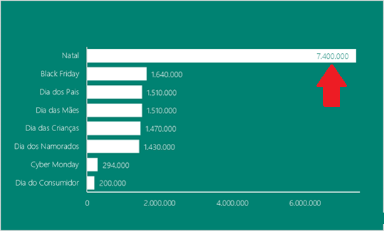
Hello everyone.
I would like to know if it is possible to create a graph of this, that when the bar is
too large the values pass into the segment automatically. Or the opposite, I set
up a chart with the values inside the segment and when the bar is small the
values appear on the bars.
Accepted Solutions
- Mark as New
- Bookmark
- Subscribe
- Mute
- Subscribe to RSS Feed
- Permalink
- Report Inappropriate Content
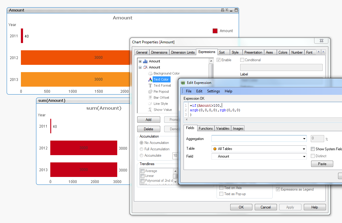
Hi Marcio,
I use the text color expression of the line expression to hide the text when it is not needed.
- Mark as New
- Bookmark
- Subscribe
- Mute
- Subscribe to RSS Feed
- Permalink
- Report Inappropriate Content
I don't think you will be able to achieve this using the inbuilt QlikView functionalities.
- Mark as New
- Bookmark
- Subscribe
- Mute
- Subscribe to RSS Feed
- Permalink
- Report Inappropriate Content
Hi,
In my experience, having values displayed next to the bar usualy auto scales unless you change a whole bunch of properties and custom layouts.
Does the usual scaling cut off your values or is that your requirement to make the unusualy large bar stand out?
If your chart is getting cut off, I'd suggest recreating the bar chart using the required dimension and expression and see if it displays all vaules. Then add on the formatting and see what causes it to get cut off.
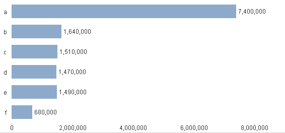
As you can see below, the chart displays correctly and does not get cut off...Qvw attached as well.
- Mark as New
- Bookmark
- Subscribe
- Mute
- Subscribe to RSS Feed
- Permalink
- Report Inappropriate Content
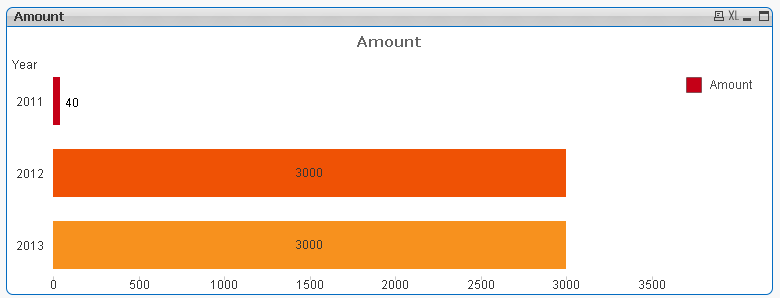
Something like this? See atached
- Mark as New
- Bookmark
- Subscribe
- Mute
- Subscribe to RSS Feed
- Permalink
- Report Inappropriate Content
May be you can try like mentioned in attached image.
Define your axis range
- Mark as New
- Bookmark
- Subscribe
- Mute
- Subscribe to RSS Feed
- Permalink
- Report Inappropriate Content
That's it, Stigchel.
You used bars and lines.
I tried to reproduce, but it did not look the same. The values appear within the segment and on the bars. What did I stop? Follows attached.
- Mark as New
- Bookmark
- Subscribe
- Mute
- Subscribe to RSS Feed
- Permalink
- Report Inappropriate Content
Hi Marcio,
I use the text color expression of the line expression to hide the text when it is not needed.
- Mark as New
- Bookmark
- Subscribe
- Mute
- Subscribe to RSS Feed
- Permalink
- Report Inappropriate Content
Hi, Stigchel.
Okay, it worked.
Thank you.