Unlock a world of possibilities! Login now and discover the exclusive benefits awaiting you.
- Qlik Community
- :
- All Forums
- :
- QlikView App Dev
- :
- Bar graph plotting
- Subscribe to RSS Feed
- Mark Topic as New
- Mark Topic as Read
- Float this Topic for Current User
- Bookmark
- Subscribe
- Mute
- Printer Friendly Page
- Mark as New
- Bookmark
- Subscribe
- Mute
- Subscribe to RSS Feed
- Permalink
- Report Inappropriate Content
Bar graph plotting
Hi All ,
I have a requirement where :
I need to display the sales for every year :
2005 - 50 K
2006- 30K
2007- 20K
2008- 4K
2009- 1K
2010- 400
The plotting of a bar graph , will be such that , the smaller values like 400 ,1K , will be hardly visible .
How can i make them look prominent too .
Please advice .
Thanks !
- Mark as New
- Bookmark
- Subscribe
- Mute
- Subscribe to RSS Feed
- Permalink
- Report Inappropriate Content
Hi Mamtha Anand,
This remind me of a chapter in this book that I have:
Learning QlikView Data Visualization | PACKT Books
There it is been said:
"Be careful not to purposely manipulate a line chart so as to show more or less growth."
You can ultimately manipulate the values of (2009 - 1K) and (2010 - 400) but it's not a moral method. You can change that by using a set analysis like this:
For 2009 to look as if it has the almost the same length as 2008
=sum({$<year = {2009}>} Sales) * 3
And in the legend text put the right value
As for 2010 to look as if it has half the same length as 2008
=sum({$<year = {2010}>} Sales) * 5
And again in the legend text put the right value.
Ultimately you can change bar chart to line chart so that the final User can see better the great decrease of Sales 
Regards,
MB
- Mark as New
- Bookmark
- Subscribe
- Mute
- Subscribe to RSS Feed
- Permalink
- Report Inappropriate Content
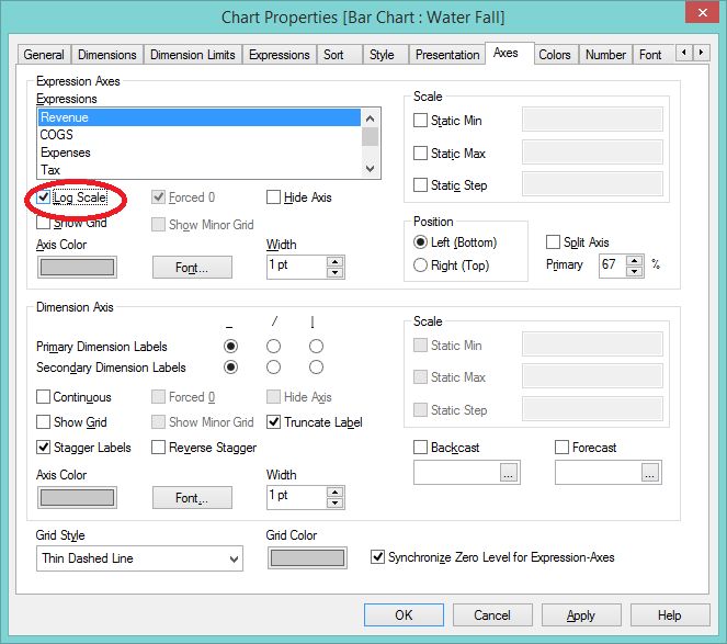
Hi Mamtha,
you could use a log scale. In your chart properties, go to the Axes tab, and set it there.
This is a massive dodge, and quite misleading though. If the data itself isn't prominent, then you shouldn't artificially inflate it to prominence.
If, however you're highlighting failure to achieve a target, then that's a different matter...