Unlock a world of possibilities! Login now and discover the exclusive benefits awaiting you.
- Qlik Community
- :
- All Forums
- :
- QlikView App Dev
- :
- Re: Bubble Chart
- Subscribe to RSS Feed
- Mark Topic as New
- Mark Topic as Read
- Float this Topic for Current User
- Bookmark
- Subscribe
- Mute
- Printer Friendly Page
- Mark as New
- Bookmark
- Subscribe
- Mute
- Subscribe to RSS Feed
- Permalink
- Report Inappropriate Content
Bubble Chart
Hi,
I am stuck at Bubble chart.
Please find attachment and see the Sheet1, I have dimension is Name and i want to create one bubble chart with Y-Axis is score of avg with two exclude names like Key Message Delivery, Sales Objective Category.
And I want to show bubble is Count(groupObservation).
I want to see very clear with bubble size accuracy Good.
- Anil
- « Previous Replies
-
- 1
- 2
- Next Replies »
- Mark as New
- Bookmark
- Subscribe
- Mute
- Subscribe to RSS Feed
- Permalink
- Report Inappropriate Content
Hi
Try like this
Count({<name -= {'Key Message Delivery','Sales Objective Category'}>} groupObservation) in "Z" Axis to show the bubble based on "Count"
Please close the thread by marking correct answer & give likes if you like the post.
- Mark as New
- Bookmark
- Subscribe
- Mute
- Subscribe to RSS Feed
- Permalink
- Report Inappropriate Content
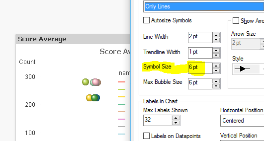
I got the solution from jontydkpi. Unfortunately, I forget to apply the Z-axis
I am expecting Bubble size - I want to increase my bubble size?
- Mark as New
- Bookmark
- Subscribe
- Mute
- Subscribe to RSS Feed
- Permalink
- Report Inappropriate Content
Got It..
- « Previous Replies
-
- 1
- 2
- Next Replies »