Unlock a world of possibilities! Login now and discover the exclusive benefits awaiting you.
- Qlik Community
- :
- All Forums
- :
- QlikView App Dev
- :
- Change scatter chart axes points from numbers to t...
- Subscribe to RSS Feed
- Mark Topic as New
- Mark Topic as Read
- Float this Topic for Current User
- Bookmark
- Subscribe
- Mute
- Printer Friendly Page
- Mark as New
- Bookmark
- Subscribe
- Mute
- Subscribe to RSS Feed
- Permalink
- Report Inappropriate Content
Change scatter chart axes points from numbers to text
Hello QV gurus,
I have a scatter chart that is meant to have the following fields as expressions: [% Complete] as x axis, [Area] as y axis and [$ Value] as Z/Bubble.
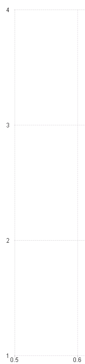
The [Area] field has the following values: West, East, Central, Other. I could not get this field to work as my y-axis expression so have assigned a value to each, now using the [Rank] field in which 1 = West, 2 = East, 3 = Central, 4 = Other.
The graph now appears as it should, though I'm not sure if I can change the [Rank] field to display the [Area] values along the y-axis? As in the below image, 4 would show 'Other', 3 would display as 'Central', etc.
Thanks for your advice!
Melissa