Unlock a world of possibilities! Login now and discover the exclusive benefits awaiting you.
- Qlik Community
- :
- All Forums
- :
- QlikView App Dev
- :
- Change x-axis scale
- Subscribe to RSS Feed
- Mark Topic as New
- Mark Topic as Read
- Float this Topic for Current User
- Bookmark
- Subscribe
- Mute
- Printer Friendly Page
- Mark as New
- Bookmark
- Subscribe
- Mute
- Subscribe to RSS Feed
- Permalink
- Report Inappropriate Content
Change x-axis scale
Hi,
I am a very new user of Qlik Sense. I encounter some issues with the visualisation of a line chart. So I've computed the following line chart :
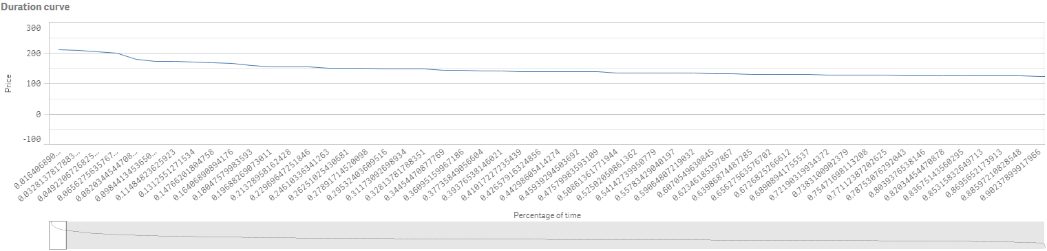
Dimension : 100*aggr(Rank(Price,1,1),date)/(max(total aggr(rank(Price),date))+1)
Measure : Price
And I would like something more similar to this (It is the same graph computed on Excel) :
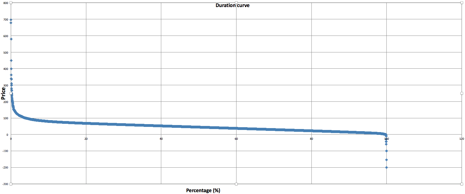
The general trend seems more clear in the second chart. So I wanted to know how to get a more similar chart in qlik (maybe change the scale of the X-axis and only represent integer value would reduce the length of the first graph)
Accepted Solutions
- Mark as New
- Bookmark
- Subscribe
- Mute
- Subscribe to RSS Feed
- Permalink
- Report Inappropriate Content
And sorry for mistake
if(PercentField >0.00 and PercentField<=0.20,'20',
if(PercentField >0.20 and PercentField<=0.40,'40',
if(PercentField >0.40 and PercentField<=0.60,'60',
if(PercentField >0.60 and PercentField<=0.80,'80',
if(PercentField >0.80 and PercentField<=1,'100',
if(PercentField =0.00 ,'0')))))) as NewField
- Mark as New
- Bookmark
- Subscribe
- Mute
- Subscribe to RSS Feed
- Permalink
- Report Inappropriate Content
Can you provide QVF file?
- Mark as New
- Bookmark
- Subscribe
- Mute
- Subscribe to RSS Feed
- Permalink
- Report Inappropriate Content
May be try using scatter or grid chart.
- Mark as New
- Bookmark
- Subscribe
- Mute
- Subscribe to RSS Feed
- Permalink
- Report Inappropriate Content
Sorry I am not sure to be able to provide you the QVF file but here's an excel with the data regarding to my question (the dimension and measure of the line chart are mentioned in my first post)
- Mark as New
- Bookmark
- Subscribe
- Mute
- Subscribe to RSS Feed
- Permalink
- Report Inappropriate Content
Hi, anyone knows how to resolve my problem ?
I thank you in advance
- Mark as New
- Bookmark
- Subscribe
- Mute
- Subscribe to RSS Feed
- Permalink
- Report Inappropriate Content
Create a Dimension by Using Class(Fieldname*100,20)
Else in Script,
if(PercentField >0.00 and PercentField<=0.20,'20',
if(PercentField >0.20 and PercentField<=0.40,'40',
if(PercentField >0.40 and PercentField<=0.60,'60',
if(PercentField >0.60 and PercentField<=0.80,'80',
if(PercentField >0.80 and PercentField<=1,'100',
if(PercentField =0.80 ,'0')))))) as NewField
Use this new field in Dimension
- Mark as New
- Bookmark
- Subscribe
- Mute
- Subscribe to RSS Feed
- Permalink
- Report Inappropriate Content
Hi, I didn't get this condition : if(PercentField =0.80 ,'0'). Could you give me more explanation please ?
Thank you for your answer I will test it right now
- Mark as New
- Bookmark
- Subscribe
- Mute
- Subscribe to RSS Feed
- Permalink
- Report Inappropriate Content
Here you are comparing Values of Fields to create buckets shown in the chart created in Excel..
- Mark as New
- Bookmark
- Subscribe
- Mute
- Subscribe to RSS Feed
- Permalink
- Report Inappropriate Content
And sorry for mistake
if(PercentField >0.00 and PercentField<=0.20,'20',
if(PercentField >0.20 and PercentField<=0.40,'40',
if(PercentField >0.40 and PercentField<=0.60,'60',
if(PercentField >0.60 and PercentField<=0.80,'80',
if(PercentField >0.80 and PercentField<=1,'100',
if(PercentField =0.00 ,'0')))))) as NewField