Unlock a world of possibilities! Login now and discover the exclusive benefits awaiting you.
- Qlik Community
- :
- All Forums
- :
- QlikView App Dev
- :
- Chart Aggr - Max of Dimension
- Subscribe to RSS Feed
- Mark Topic as New
- Mark Topic as Read
- Float this Topic for Current User
- Bookmark
- Subscribe
- Mute
- Printer Friendly Page
- Mark as New
- Bookmark
- Subscribe
- Mute
- Subscribe to RSS Feed
- Permalink
- Report Inappropriate Content
Chart Aggr - Max of Dimension
Hi all,
I'm having loads of fun with charts, but have come across the below and wonder if anyone can help.
I have a chart as follows;
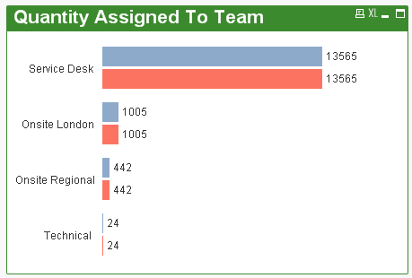
The Blue bar is calculated by an expression =count(AssignedToTeam)
I want the red to show the Max of count(AssignedToTeam) in the chart.
After reading my qlikview developer book and looking online I have come up with the following expression and can't figure out why it isn't working as I expect.
=max(aggr(count([AssignedToTeam]), [AssignedToTeam]))
I want all of the Red bars to be the Max Value. In this example 13565.
This is probably an easy one, but I can't see why this isn't giving me what I want.
Many thanks.
Accepted Solutions
- Mark as New
- Bookmark
- Subscribe
- Mute
- Subscribe to RSS Feed
- Permalink
- Report Inappropriate Content
What is your dimension? If your dimension is also AssignedToTeam, then try this (you need to add the total qualifier):
=max(total aggr(count([AssignedToTeam]), [AssignedToTeam]))
or if its not your dimension, use:
=max(total aggr(count([AssignedToTeam]), YOURDIMENSION))
Hope this helps!
- Mark as New
- Bookmark
- Subscribe
- Mute
- Subscribe to RSS Feed
- Permalink
- Report Inappropriate Content
Could you upload a sample qvw?
- Mark as New
- Bookmark
- Subscribe
- Mute
- Subscribe to RSS Feed
- Permalink
- Report Inappropriate Content
when you use aggregation it will give the maximum value for that particular AssignedToTeam.
you cant get the same value for all
- Mark as New
- Bookmark
- Subscribe
- Mute
- Subscribe to RSS Feed
- Permalink
- Report Inappropriate Content
What is your dimension? If your dimension is also AssignedToTeam, then try this (you need to add the total qualifier):
=max(total aggr(count([AssignedToTeam]), [AssignedToTeam]))
or if its not your dimension, use:
=max(total aggr(count([AssignedToTeam]), YOURDIMENSION))
Hope this helps!
- Mark as New
- Bookmark
- Subscribe
- Mute
- Subscribe to RSS Feed
- Permalink
- Report Inappropriate Content
Thanks Jeremiah, your a star.
I thought I was close.
Thanks to everyone else for their help also.