Unlock a world of possibilities! Login now and discover the exclusive benefits awaiting you.
- Qlik Community
- :
- All Forums
- :
- QlikView App Dev
- :
- Chart Design
- Subscribe to RSS Feed
- Mark Topic as New
- Mark Topic as Read
- Float this Topic for Current User
- Bookmark
- Subscribe
- Mute
- Printer Friendly Page
- Mark as New
- Bookmark
- Subscribe
- Mute
- Subscribe to RSS Feed
- Permalink
- Report Inappropriate Content
Chart Design
Hi,
I am new to Qlik, I want to create chart.
Can any one suggest?
Accepted Solutions
- Mark as New
- Bookmark
- Subscribe
- Mute
- Subscribe to RSS Feed
- Permalink
- Report Inappropriate Content
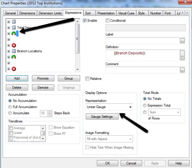
If you make your expression a linear gauge instead of a mini chart, you can achieve a horizontal bar chart look.
Min value = 0
Max value = whatever will contain all of your values
You can adjust the settings to change the appearance.
- Mark as New
- Bookmark
- Subscribe
- Mute
- Subscribe to RSS Feed
- Permalink
- Report Inappropriate Content
You can use a straight table and use minichart representations for the expressions for the bar and line chart columns.
talk is cheap, supply exceeds demand
- Mark as New
- Bookmark
- Subscribe
- Mute
- Subscribe to RSS Feed
- Permalink
- Report Inappropriate Content
Can you elaborate please?
I made List Box then from that made mini Chart.
But unable to make it horizontal.
- Mark as New
- Bookmark
- Subscribe
- Mute
- Subscribe to RSS Feed
- Permalink
- Report Inappropriate Content
You need to create a new chart and then choose straight table.
Add institution as a dimension, create your expressions and for the expressions that you would like to present in minichart, choose mini-chart in the drop-down-box under representation on the expression tab. There can you select many different kind of mini-charts.
BR
Fredrik
- Mark as New
- Bookmark
- Subscribe
- Mute
- Subscribe to RSS Feed
- Permalink
- Report Inappropriate Content
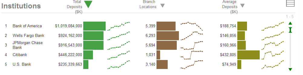
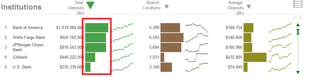
Yes I understood that point.
But problem is I am unable to make chart highlighted in Red box.
please see below image
- Mark as New
- Bookmark
- Subscribe
- Mute
- Subscribe to RSS Feed
- Permalink
- Report Inappropriate Content
Ok, i understand. I actually think that is a linear gauge representation.
You can download the app in your screenshot from Qlik's demo site. It can be found here:Qlik Demos: See QlikView in Action | Demo.Qlik.Com
- Mark as New
- Bookmark
- Subscribe
- Mute
- Subscribe to RSS Feed
- Permalink
- Report Inappropriate Content
I know that Link.
But how to make that chart?
I am using personal Edition, might be this is the reason why I am unable to edit from downloaded .qvw file!
I dont have much detail of Qlik.
- Mark as New
- Bookmark
- Subscribe
- Mute
- Subscribe to RSS Feed
- Permalink
- Report Inappropriate Content
Try using a linear gauge instead of a minichart.
See this thread for examples:
- Mark as New
- Bookmark
- Subscribe
- Mute
- Subscribe to RSS Feed
- Permalink
- Report Inappropriate Content
If you make your expression a linear gauge instead of a mini chart, you can achieve a horizontal bar chart look.
Min value = 0
Max value = whatever will contain all of your values
You can adjust the settings to change the appearance.
- Mark as New
- Bookmark
- Subscribe
- Mute
- Subscribe to RSS Feed
- Permalink
- Report Inappropriate Content
Ok, i was hoping you could open that app and look at the properties for that specific graph.
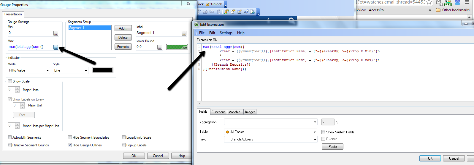
So to be able to create that column in the graph with the horizontal bar, start with choosing linear gauge. Then you need to define a min and a max value. Max value usually is the largest Sales amount or something similar. Then its just some fine tunings left to do, like bar color, indicator style.
see attached images.