Unlock a world of possibilities! Login now and discover the exclusive benefits awaiting you.
- Qlik Community
- :
- All Forums
- :
- QlikView App Dev
- :
- Chart Layout help Required
- Subscribe to RSS Feed
- Mark Topic as New
- Mark Topic as Read
- Float this Topic for Current User
- Bookmark
- Subscribe
- Mute
- Printer Friendly Page
- Mark as New
- Bookmark
- Subscribe
- Mute
- Subscribe to RSS Feed
- Permalink
- Report Inappropriate Content
Chart Layout help Required
How can i Create a similar looking Chart to the one below in Qlikview 12.
I cannot see any help or links to do this. Any help or advice greatly received.
In Excel I can create a pivottable then a chart from that giving me a grouped x axis chart.
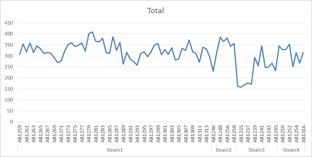
the raw data looks like:
- « Previous Replies
-
- 1
- 2
- Next Replies »
Accepted Solutions
- Mark as New
- Bookmark
- Subscribe
- Mute
- Subscribe to RSS Feed
- Permalink
- Report Inappropriate Content
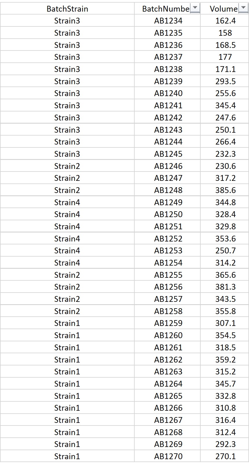
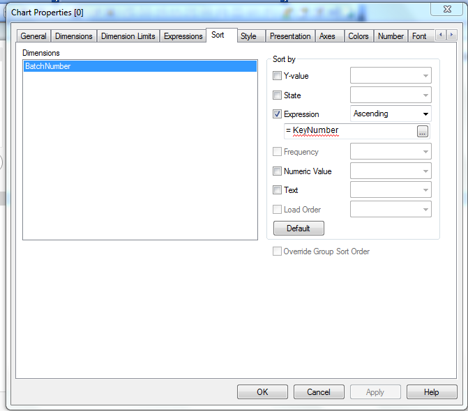
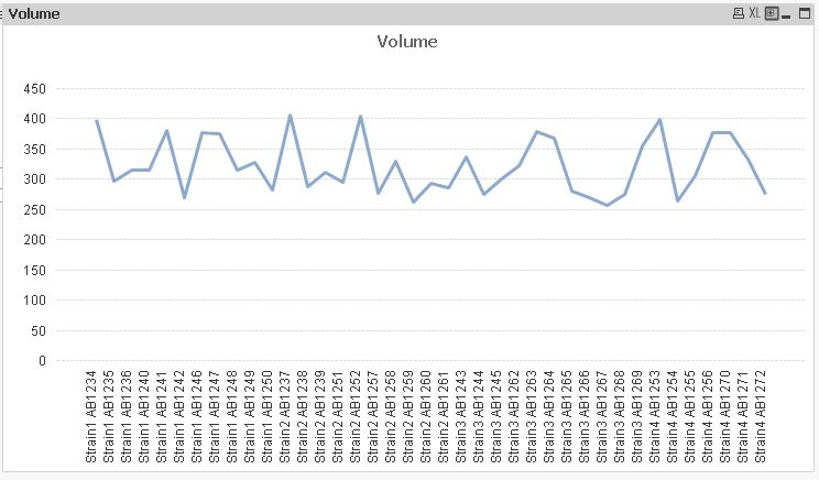
Oh sorry Michael, I have used a key to sort rather than the BatchStrain field.
I have used the below script to load and used the keynumber in the sort expression.
LOAD AutoNumber(BatchStrain) AS KeyNumber,
Volume,
BatchStrain,
BatchNumber
FROM
[..\Desktop\Qlik-ExcelTest.xlsx]
(ooxml, embedded labels);
Let me know if this helps.
Thanks,
V.
- Mark as New
- Bookmark
- Subscribe
- Mute
- Subscribe to RSS Feed
- Permalink
- Report Inappropriate Content
Hello Michael,
Did you try using line chart from Sheet objects in Qlikview. ?
Can you upload this raw data excel sheet if possible, so that we can work on it to get the most possible look of what you have sent.
Thanks,
V.
- Mark as New
- Bookmark
- Subscribe
- Mute
- Subscribe to RSS Feed
- Permalink
- Report Inappropriate Content
Hi there.
Yes I did try the Line chart both setting up manually and through the chart wizard.
I have attached an excel spreadsheet containing the raw data, a PivotTable and PivotChart created from the Raw Data. This is the type of Chart I am trying to recreate.
I have attached a Qlik sheet containing the Raw Data, a chart created from the Raw Data and a PivotTable created from the Raw Data. I cannot see how to create a Chart based on the PivotTable or how to create a Chart from the Raw Data but looking like my required chart.
Usually in my case, I have missed seeing something in my hastiness to acheive, but would appreciate any help and advice.
- Mark as New
- Bookmark
- Subscribe
- Mute
- Subscribe to RSS Feed
- Permalink
- Report Inappropriate Content
May be try to combine the field BatchStrain&' '&BatchNumber in the calculated dimension.
see the screen shot.
- Mark as New
- Bookmark
- Subscribe
- Mute
- Subscribe to RSS Feed
- Permalink
- Report Inappropriate Content
This is the closest I could get to a pivot-chart!

- Mark as New
- Bookmark
- Subscribe
- Mute
- Subscribe to RSS Feed
- Permalink
- Report Inappropriate Content
The Grouping in this manner is not possible in Qlikview for a line chart.
- Mark as New
- Bookmark
- Subscribe
- Mute
- Subscribe to RSS Feed
- Permalink
- Report Inappropriate Content
Hi, Michael,
as far as I know in QlikView this is possible with the bar chart only. See the picture below:
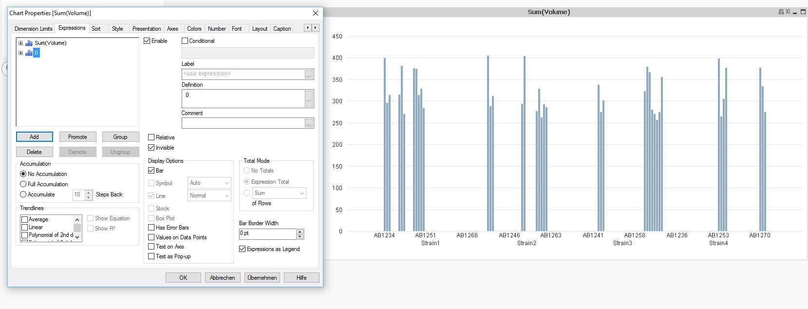
The workaround is to add an invisible second expression ( I used 0). That's all.
Hope this helps
Burkhard
- Mark as New
- Bookmark
- Subscribe
- Mute
- Subscribe to RSS Feed
- Permalink
- Report Inappropriate Content
I only Have the personal desktop edition at the moment so I cannot open your file.
- Mark as New
- Bookmark
- Subscribe
- Mute
- Subscribe to RSS Feed
- Permalink
- Report Inappropriate Content
It looks nice as a pivot chart in excel and easy for managers to understand. I will have to go with the suggestion from settu_periasamy
Just looks a bit messy
Kind of thought this software would do at least what excel could do and much more.
- Mark as New
- Bookmark
- Subscribe
- Mute
- Subscribe to RSS Feed
- Permalink
- Report Inappropriate Content
Hello Michael,
The best work around would be the one mentioned by Settu above.
However, if you use BatchStrain in your dimensions with your BatchNumber if would differentiate the Strain by individual colors. Like below: 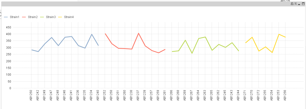
- « Previous Replies
-
- 1
- 2
- Next Replies »