Unlock a world of possibilities! Login now and discover the exclusive benefits awaiting you.
- Qlik Community
- :
- All Forums
- :
- QlikView App Dev
- :
- Chart aggregation with Dimension missing Data
- Subscribe to RSS Feed
- Mark Topic as New
- Mark Topic as Read
- Float this Topic for Current User
- Bookmark
- Subscribe
- Mute
- Printer Friendly Page
- Mark as New
- Bookmark
- Subscribe
- Mute
- Subscribe to RSS Feed
- Permalink
- Report Inappropriate Content
Chart aggregation with Dimension missing Data
Hi all
I am trying to show a chart on each Salesperson's dashboard that will show the entire team's sales so they can compare how they are doing against the entire team.
Data:
| ID | SalespersonName | Team | Item | Revenue | Year | Month |
| 001 | Nick | North | Pizza | 15 | 2012 | 1 |
| 001 | Nick | North | HotDog | 10 | 2012 | 1 |
| 002 | Katie | North | Pizza | 12 | 2012 | 1 |
| 002 | Katie | North | Pizza | 30 | 2012 | 2 |
| 003 | Henry | North | Pizza | 7 | 2012 | 1 |
| 003 | Henry | North | HotDog | 10 | 2012 | 2 |
| 003 | Henry | North | HotDog | 16 | 2012 | 1 |
| 004 | Ryan | West | Pizza | 40 | 2012 | 1 |
| 004 | Ryan | West | HotDog | 101 | 2012 | 1 |
| 004 | Ryan | West | HotDog | 45 | 2012 | 2 |
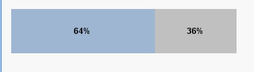
on the Pages for Nick and Henry, the graph displays correctly: 64 pizza vs 36 HotDog (Nick/Katie/Henry are all on the "North" team, so Ryan's sales are ignored)
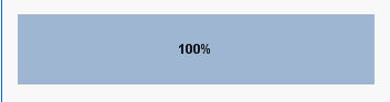
however the graph for Katie is incorrect, I am presuming because she only sold Pizza, but i want her graph to look like the above since she is still on the North team regardless of the fact that she sold 0 Hot Dog Individually.
My chart is basaed on the "Item" dimension, expression is
=aggr(nodistinct sum({<Id=,SalespersonName=,Year={'2012'},Salesgroup=>}Revenue),[Item],[Salesgroup])
i think i am missing an if statement or something
thanks in advance!
Accepted Solutions
- Mark as New
- Bookmark
- Subscribe
- Mute
- Subscribe to RSS Feed
- Permalink
- Report Inappropriate Content
I think i may have solved the issue..let me know if you see any problems with this formula, it seems to be working...
i added two expresions:
=num(aggr(sum({<Id=,SalespersonName=,Year={'2012'},Month={"<=$(vmaxmonth)"},Iteam={'HotDog'},Salesgroup>}Revenue), Salesgroup)
/
aggr(sum({<Id=,SalespersonName=,Year={'2012'},Month={"<=$(vmaxmonth)"},Iteam,Salesgroup>}Revenue), Salesgroup),'#,##0%')
=num(aggr(sum({<Id=,SalespersonName=,Year={'2012'},Month={"<=$(vmaxmonth)"},Iteam={'Pizza'},Salesgroup>}Revenue), Salesgroup)
/
aggr(sum({<Id=,SalespersonName=,Year={'2012'},Month={"<=$(vmaxmonth)"},Iteam,Salesgroup>}Revenue), Salesgroup),'#,##0%')
- Mark as New
- Bookmark
- Subscribe
- Mute
- Subscribe to RSS Feed
- Permalink
- Report Inappropriate Content
I haven't fully understood how your chart is build. You are using only one dimension (Item) and one expression (see above), but how do you get the stacked bar chart and how do you relate the chart to the salesperson on which dashboard the chart is located?
In general, I would assume that you don't need the aggr() function, a sum with TOTAL qualifier and field list should do, maybe something like
sum(TOTAL<Item, Salesgroup> Revenue)
(this probably won't do, you might need to add the set expression to limit the data like you need etc, and I am not sure about the correct field list to TOTAL, since I don't understand your setting).
Regards,
Stefan
- Mark as New
- Bookmark
- Subscribe
- Mute
- Subscribe to RSS Feed
- Permalink
- Report Inappropriate Content
sorry, forgot to mention in order to get the bar stacked like that I created a dummy calculated dimension called 'x' calculated as ='x' then just hid that off screen
- Mark as New
- Bookmark
- Subscribe
- Mute
- Subscribe to RSS Feed
- Permalink
- Report Inappropriate Content
I think i may have solved the issue..let me know if you see any problems with this formula, it seems to be working...
i added two expresions:
=num(aggr(sum({<Id=,SalespersonName=,Year={'2012'},Month={"<=$(vmaxmonth)"},Iteam={'HotDog'},Salesgroup>}Revenue), Salesgroup)
/
aggr(sum({<Id=,SalespersonName=,Year={'2012'},Month={"<=$(vmaxmonth)"},Iteam,Salesgroup>}Revenue), Salesgroup),'#,##0%')
=num(aggr(sum({<Id=,SalespersonName=,Year={'2012'},Month={"<=$(vmaxmonth)"},Iteam={'Pizza'},Salesgroup>}Revenue), Salesgroup)
/
aggr(sum({<Id=,SalespersonName=,Year={'2012'},Month={"<=$(vmaxmonth)"},Iteam,Salesgroup>}Revenue), Salesgroup),'#,##0%')