Unlock a world of possibilities! Login now and discover the exclusive benefits awaiting you.
- Qlik Community
- :
- All Forums
- :
- QlikView App Dev
- :
- Chart with 2 Y axis - X axis in unexpected positio...
- Subscribe to RSS Feed
- Mark Topic as New
- Mark Topic as Read
- Float this Topic for Current User
- Bookmark
- Subscribe
- Mute
- Printer Friendly Page
- Mark as New
- Bookmark
- Subscribe
- Mute
- Subscribe to RSS Feed
- Permalink
- Report Inappropriate Content
Chart with 2 Y axis - X axis in unexpected position
Hi All,
I've created a combo chart to show absolute values in bars and percentage change as a line. Two separate Y axes - one for the absolute and one for the percentage. Percentage can be negative as well as positive, absolutes positive only in the range of 0 - 500,000.
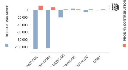
When the chart is displayed the absolute values axis is very compressed at the top of the chart, moving the X axis right up:
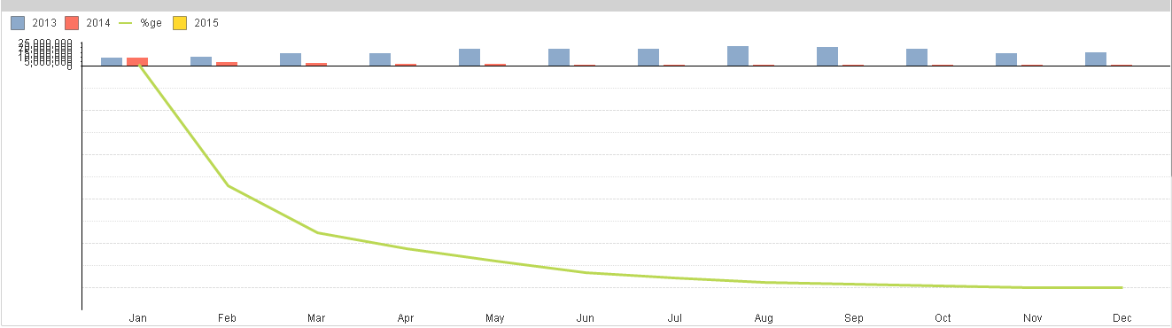
(I know it's not in the image above, but there is an axis of the right of 0 at the X to 100% at the bottom right, in 20% increments),
Is there anyway of forcing the X-axis to be at the centre of the chart so that the absoulute values are more readable?
Thanks,
Rory.
- « Previous Replies
-
- 1
- 2
- Next Replies »
- Mark as New
- Bookmark
- Subscribe
- Mute
- Subscribe to RSS Feed
- Permalink
- Report Inappropriate Content
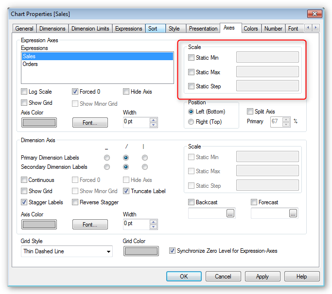
You can set a static min and max for each expression. Set the static max for your bar chart expression to be higher. You can either use a static value, or an expression such as =max(myvalue) + 1000
- Mark as New
- Bookmark
- Subscribe
- Mute
- Subscribe to RSS Feed
- Permalink
- Report Inappropriate Content
Hi Kai,
Thanks for the suggestion, but all that did was change the y-axis values above the X-axis. It didn't move the x-axis down towards the centre of the chart at all.
Thanks,
Rory.
- Mark as New
- Bookmark
- Subscribe
- Mute
- Subscribe to RSS Feed
- Permalink
- Report Inappropriate Content
Rory
I guess that on your Chart Axes tab you have the Split Axis selected.
Just below this is the Primary %, have you tried adjusting this ?
Best Regards, Bill
- Mark as New
- Bookmark
- Subscribe
- Mute
- Subscribe to RSS Feed
- Permalink
- Report Inappropriate Content
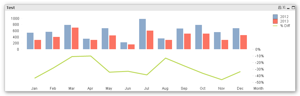
I just tried it with some test data and it looks fine. Can you compare your solution with mine to see where the difference is? See qvw attached.
- Mark as New
- Bookmark
- Subscribe
- Mute
- Subscribe to RSS Feed
- Permalink
- Report Inappropriate Content
btw I get the same result if I use very large numbers up to 500,000
- Mark as New
- Bookmark
- Subscribe
- Mute
- Subscribe to RSS Feed
- Permalink
- Report Inappropriate Content
Kai,
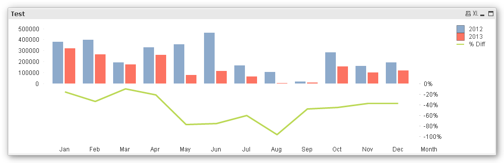
I can reproduce this when using a mixed sign value range for one expression.
Check attached.
- Mark as New
- Bookmark
- Subscribe
- Mute
- Subscribe to RSS Feed
- Permalink
- Report Inappropriate Content
OK.... so I attached my laptop to a projector and it then fixed itself. Not sure if it was just a display bug or a dashboard refresh issue. Very strange.
So anyway, fixed now, but thank you for the suggestions everyone!
- Mark as New
- Bookmark
- Subscribe
- Mute
- Subscribe to RSS Feed
- Permalink
- Report Inappropriate Content
Ouch. Looks horrible.
- Mark as New
- Bookmark
- Subscribe
- Mute
- Subscribe to RSS Feed
- Permalink
- Report Inappropriate Content
Dear Folks,
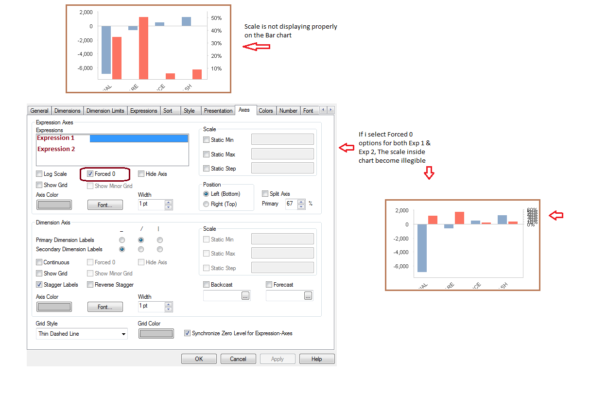
I am also having the same problem with the Scale when the chart is a showing 2 KPI with two axis.
Currently my chart is looking like this, The scale inside chart becomes illegible for few selections
If I use the Static Max property it works good for some of the selections but not for all, Below first screenshot if I deselect forced 0 property for both the expression.
Is there any other way to resolve this?
Thank you in advance.
Best Regards,
PRC
- « Previous Replies
-
- 1
- 2
- Next Replies »