Unlock a world of possibilities! Login now and discover the exclusive benefits awaiting you.
- Qlik Community
- :
- All Forums
- :
- QlikView App Dev
- :
- Chart with all data values
- Subscribe to RSS Feed
- Mark Topic as New
- Mark Topic as Read
- Float this Topic for Current User
- Bookmark
- Subscribe
- Mute
- Printer Friendly Page
- Mark as New
- Bookmark
- Subscribe
- Mute
- Subscribe to RSS Feed
- Permalink
- Report Inappropriate Content
Chart with all data values
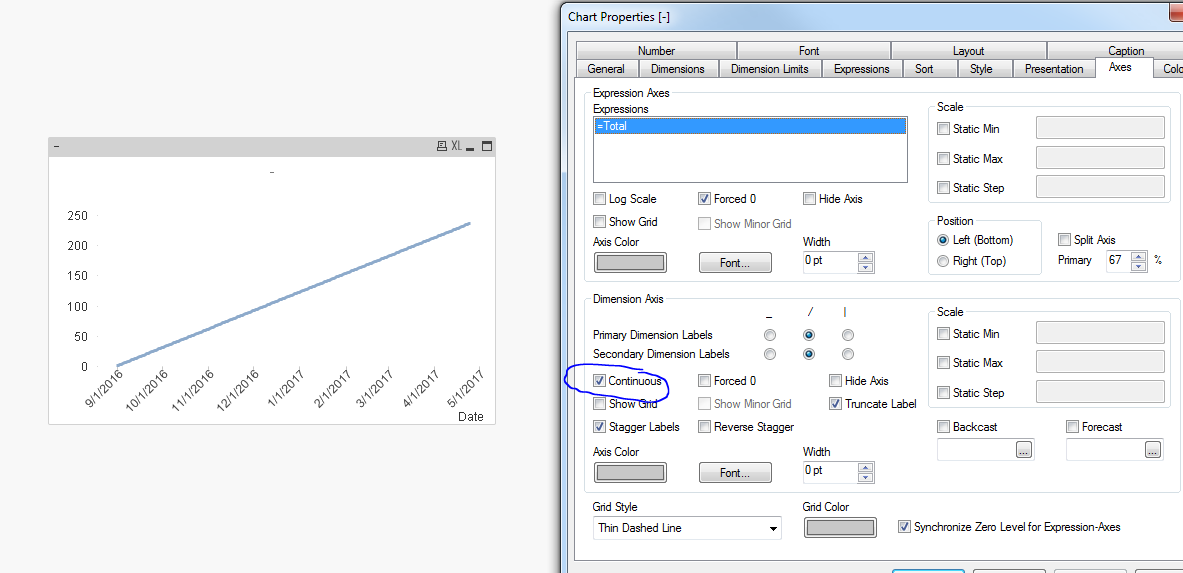
I have a chart for which the dimension is a date and three expressions. The date starts at 9/1/2017 and adds a new day every day, so the number of data points on the x-axis is always increasing. I want the chart to always show all of the data points at the beginning so that the user can choose a date range from a calendar above. How can I format the chart to display all the data points as opposed to what it is showing now, which is currently only through 12/15/2016?
Accepted Solutions
- Mark as New
- Bookmark
- Subscribe
- Mute
- Subscribe to RSS Feed
- Permalink
- Report Inappropriate Content
- Mark as New
- Bookmark
- Subscribe
- Mute
- Subscribe to RSS Feed
- Permalink
- Report Inappropriate Content
Can you share a sample app and expected output you are looking for?
- Mark as New
- Bookmark
- Subscribe
- Mute
- Subscribe to RSS Feed
- Permalink
- Report Inappropriate Content
I have the output that I am looking for, a basic chart with date (mm/dd/yyyy) as the x-axis dimension and expressions for the y-axis.
My problem is that there are currently 168 dates that I want to display on the x-value and the chart is only displaying the first 100 or so.
I want to show all of the values and then have the user select which range of dates they would want to look at.
- Mark as New
- Bookmark
- Subscribe
- Mute
- Subscribe to RSS Feed
- Permalink
- Report Inappropriate Content
Can you share a screen shot?
- Mark as New
- Bookmark
- Subscribe
- Mute
- Subscribe to RSS Feed
- Permalink
- Report Inappropriate Content
I added a sample app to my initial post
- Mark as New
- Bookmark
- Subscribe
- Mute
- Subscribe to RSS Feed
- Permalink
- Report Inappropriate Content
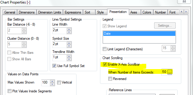
Set this in your presentation tab and see ?
- Mark as New
- Bookmark
- Subscribe
- Mute
- Subscribe to RSS Feed
- Permalink
- Report Inappropriate Content
that does work, however I want to display all of the values and not have to use the scroll bar
- Mark as New
- Bookmark
- Subscribe
- Mute
- Subscribe to RSS Feed
- Permalink
- Report Inappropriate Content
IF you want that you have to stretch the bar to right and screen size will change and scroll bar will be activated anyways to scroll bcoz there are many values...
- Mark as New
- Bookmark
- Subscribe
- Mute
- Subscribe to RSS Feed
- Permalink
- Report Inappropriate Content
May be with continuous axis?