Unlock a world of possibilities! Login now and discover the exclusive benefits awaiting you.
- Qlik Community
- :
- All Forums
- :
- QlikView App Dev
- :
- Charting using expression
- Subscribe to RSS Feed
- Mark Topic as New
- Mark Topic as Read
- Float this Topic for Current User
- Bookmark
- Subscribe
- Mute
- Printer Friendly Page
- Mark as New
- Bookmark
- Subscribe
- Mute
- Subscribe to RSS Feed
- Permalink
- Report Inappropriate Content
Charting using expression
Hi all,
i'm having an issue even getting my data to chart properly, it is all formatted properly and here is a snapshot of the data i am charting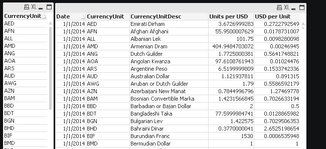
am planning on charting the currency unit of my choice, for example AUD compared to USD per unit by date for the last 1 month much like this http://www.xe.com/currencycharts/?from=AUD&to=USD&view=1M
I have the date as my dimension but cannot seem to get the expression right. Is anyone able to help
On the left on the graph it shows the amount of USD per 1 AUD which is exactly what I want to graph, and this updates each day only showing the previous month (30 days)
- Mark as New
- Bookmark
- Subscribe
- Mute
- Subscribe to RSS Feed
- Permalink
- Report Inappropriate Content
I haven't really understood your last sentence, are you talking about your current chart or the one on the external web site?
If you made a selection in CurrencyUnit field, e.g. AUD, and then create a chart with dimension Date and as expression e.g.
=Avg([USD per Unit])
what do you see?
- Mark as New
- Bookmark
- Subscribe
- Mute
- Subscribe to RSS Feed
- Permalink
- Report Inappropriate Content
Hi,
Thank you for replying i have done that and it has come up with this line chart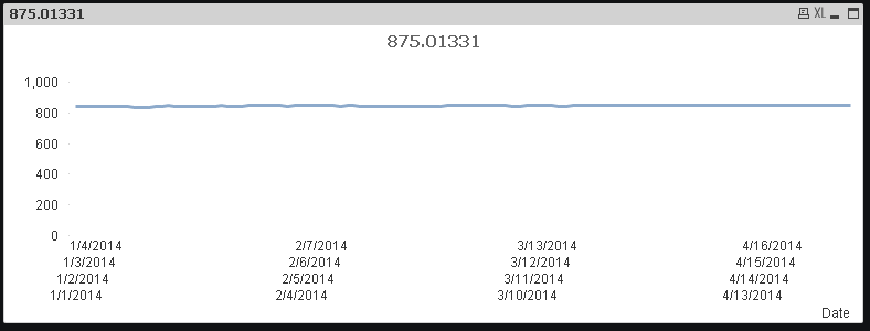
My data sample is very large and contains a large amount of time and countries.
I want the chart to depict one country for example AUD and display the data for that country for the most recent 30 data points.
How am i able to cut down the data being displayed?
- Mark as New
- Bookmark
- Subscribe
- Mute
- Subscribe to RSS Feed
- Permalink
- Report Inappropriate Content
Whoops i forgot to mention that i dont want to click an option out of the list of countries to display the data from that country
- Mark as New
- Bookmark
- Subscribe
- Mute
- Subscribe to RSS Feed
- Permalink
- Report Inappropriate Content
Try an expression like
=Avg({<CurrencyUnit = {'AUD'}, Date = {">=$(=Date(Max({1} Date)-30,'M/D/YYYY'))"}>} [USD per Unit])