Unlock a world of possibilities! Login now and discover the exclusive benefits awaiting you.
- Qlik Community
- :
- All Forums
- :
- QlikView App Dev
- :
- Color Bar Chart dependent on Total Number of Bars
- Subscribe to RSS Feed
- Mark Topic as New
- Mark Topic as Read
- Float this Topic for Current User
- Bookmark
- Subscribe
- Mute
- Printer Friendly Page
- Mark as New
- Bookmark
- Subscribe
- Mute
- Subscribe to RSS Feed
- Permalink
- Report Inappropriate Content
Color Bar Chart dependent on Total Number of Bars
Hi everyone,
I have a little problem with Coloring my Bar Chart. I managed to show only my top and bottom 5 dimensions for my expression. This works fine. I also managed to color my top 5 green and my bottom 5 red.
The code for my dimension:
=aggr( if( rank(avg(<Expression>))<=5 or rank(-avg(<Expression>))<=5 ,<Dimension>) ,<Dimension>)
The code for my color:
=If (Rank(avg(<Expression>)) <6, Red(), if (Rank(<Expression>)) > 5, Green()))
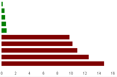
As stated above, this all works satisfying. My problem starts when the user selects something in one of the Listboxes and the total amount of rows is reduced to less than 10.

As you see, this are for of my best five rows from the Screenshot above. They are displayed in red because there are only 4 rows displayed in the Bar Chart. Therefore my question:
Do you know any possibility how to get a standard color like grey for my chart, if the total count of displayed rows in the chart is less than 10?
Something like RowNum(TOTAL) or NoOfRows did not work in that case.
Accepted Solutions
- Mark as New
- Bookmark
- Subscribe
- Mute
- Subscribe to RSS Feed
- Permalink
- Report Inappropriate Content
Thanks for your suggestion,
I tried your code, but it did not solve my problem. I still do not get the coloring I want. Perhaps there is no adequat solution to my problem and I have to think of something else to visualize. I appreciate your help, but I think, I will change my coloring to static values comparison.
- Mark as New
- Bookmark
- Subscribe
- Mute
- Subscribe to RSS Feed
- Permalink
- Report Inappropriate Content
what about a count distinct of the dimension?
or getpossiblecount
- Mark as New
- Bookmark
- Subscribe
- Mute
- Subscribe to RSS Feed
- Permalink
- Report Inappropriate Content
See if the attached example helps in your situation
- Mark as New
- Bookmark
- Subscribe
- Mute
- Subscribe to RSS Feed
- Permalink
- Report Inappropriate Content
Hi,
thank you for your help. The getpossiblecount function looks like it is working a lot of time in my case. My problem though is, that I have sometimes some dimensions without an expression value (expression value = null). Therefore my Bar Chart does not show those values, which is correct. But the getpossiblecount on this dimension of course includes those lines. So in that case I have just one row displayed but the getpossiblecount returns 49.
I would need either a way for getpossiblecount to exclude dimensions when an expression returns null or a way to count the displayed bars in my chart.
- Mark as New
- Bookmark
- Subscribe
- Mute
- Subscribe to RSS Feed
- Permalink
- Report Inappropriate Content
Hi,
thank you for your help. Unfortunatly I have to use the private Version at the moment and therefore I am not able to open your example.
- Mark as New
- Bookmark
- Subscribe
- Mute
- Subscribe to RSS Feed
- Permalink
- Report Inappropriate Content
Here is the color expression in my example. The essential changes are in bold:
=only(aggr(If(Rank(total avg({1}Expression)) <3, Red(),if(Rank(total avg({1}Expression)) > 2, Green())),Dimension))
- Mark as New
- Bookmark
- Subscribe
- Mute
- Subscribe to RSS Feed
- Permalink
- Report Inappropriate Content
Thanks for your suggestion,
I tried your code, but it did not solve my problem. I still do not get the coloring I want. Perhaps there is no adequat solution to my problem and I have to think of something else to visualize. I appreciate your help, but I think, I will change my coloring to static values comparison.