Unlock a world of possibilities! Login now and discover the exclusive benefits awaiting you.
- Qlik Community
- :
- All Forums
- :
- QlikView
- :
- Comparing two years data in bar chart showing minu...
- Subscribe to RSS Feed
- Mark Topic as New
- Mark Topic as Read
- Float this Topic for Current User
- Bookmark
- Subscribe
- Mute
- Printer Friendly Page
- Mark as New
- Bookmark
- Subscribe
- Mute
- Subscribe to RSS Feed
- Permalink
- Report Inappropriate Content
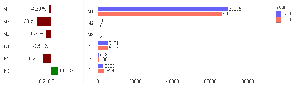
Comparing two years data in bar chart showing minus and plus values
Hello,
I want to create bar chart which will compare two years and show if 2013 was + or - in comparison with 2012.
It should look like this:
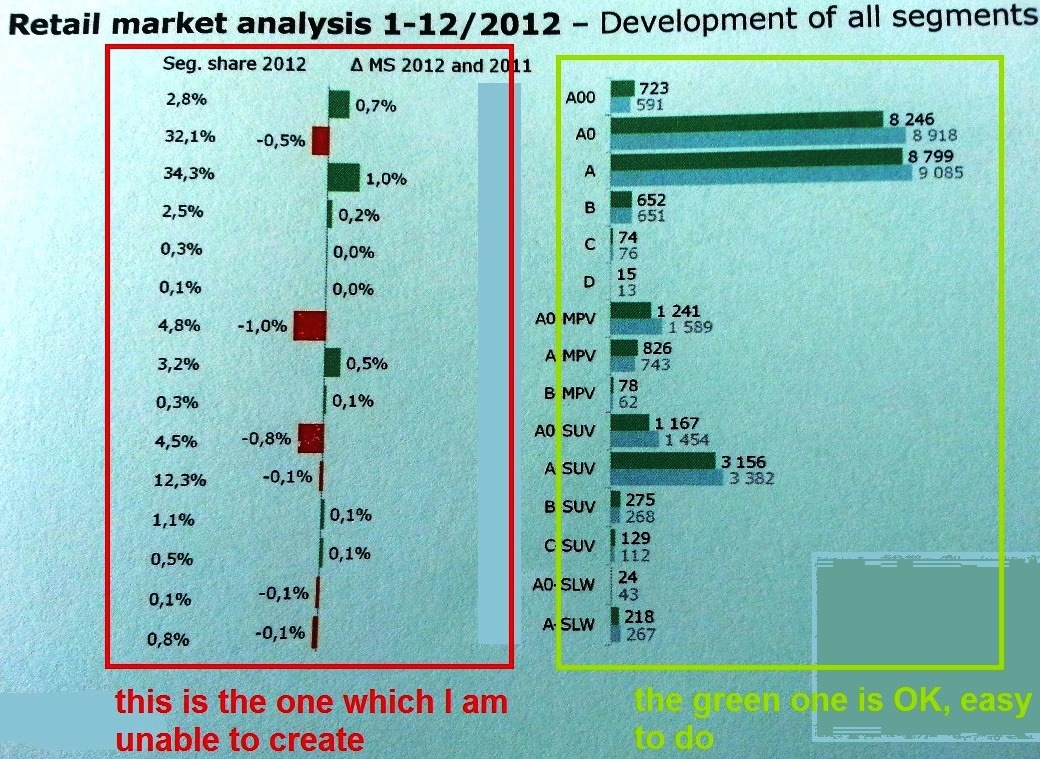
The expression of the right (green) chart is Count(VIN) - because we are counting VIN codes of cars in excel file, and dimension is Segment, or Category and Year.
I am unable to create the right expression to compare two years, in excel it should be like ((2013/2012)*100)-100
Here are few lines from the Excel source file... (Rok is Year, Mesiac is Month)
http://www.zapsr.sk/wp-content/uploads/2014/07/Two-year-comparison.xlsx
Thank you for all suggestions.
- Tags:
- new_to_qlikview
Accepted Solutions
- Mark as New
- Bookmark
- Subscribe
- Mute
- Subscribe to RSS Feed
- Permalink
- Report Inappropriate Content
- Create a bar chart
- Set the orientation to horizontal
- Create expressions to calculate the figures for the 2 years you would like to compare (but don't show these on the chart)
(I would create variables for these to include in the expressions)
- Create an expression to calculate the variance % (and show this on the chart)
- Check show values on data points
- Set a conditional background colour so that positive values are green, and negative values are red.
- Mark as New
- Bookmark
- Subscribe
- Mute
- Subscribe to RSS Feed
- Permalink
- Report Inappropriate Content
* please do not post *.qvw files - I didnt purchase Qlickview yet... so I am not able to view others apps.
Thank you.
- Mark as New
- Bookmark
- Subscribe
- Mute
- Subscribe to RSS Feed
- Permalink
- Report Inappropriate Content
- Create a bar chart
- Set the orientation to horizontal
- Create expressions to calculate the figures for the 2 years you would like to compare (but don't show these on the chart)
(I would create variables for these to include in the expressions)
- Create an expression to calculate the variance % (and show this on the chart)
- Check show values on data points
- Set a conditional background colour so that positive values are green, and negative values are red.
- Mark as New
- Bookmark
- Subscribe
- Mute
- Subscribe to RSS Feed
- Permalink
- Report Inappropriate Content
OK, i created
Count({<[Year]={'2012'}>} [VIN]) - named "2012"
and
Count({<[Year]={'2013'}>} [VIN]) - named "2013"
But I am not sure how to calculate the variance % ...i just wrote the expression as "=2013/2012" and then tried "=((2013/2012)*100)-100 but nothing of these gave me data to show
To the variables - I am a real beginner an I am not sure what they (variables) are supposed to do (but I will find It somewhere here and learn ) ...so If its not necessary to use variables, I wouldn't for now.
- Mark as New
- Bookmark
- Subscribe
- Mute
- Subscribe to RSS Feed
- Permalink
- Report Inappropriate Content
I wouldn't worry about the variables for now then.
I would first create an expression that will just show the variance:
= [2013] - [2012] - named "Variance"
Then you can reference this expression in another expression:
= [Variance] / [2012]
Make sure only the Variance expression is shown as a bar chart, and for the rest, just untick any display options (but don't disable the expression)
Next, make sure the number format of this expression is set to show as %.
- Mark as New
- Bookmark
- Subscribe
- Mute
- Subscribe to RSS Feed
- Permalink
- Report Inappropriate Content
I still have no data to display.
My expressions are as follows. Dimensions are Category and Year
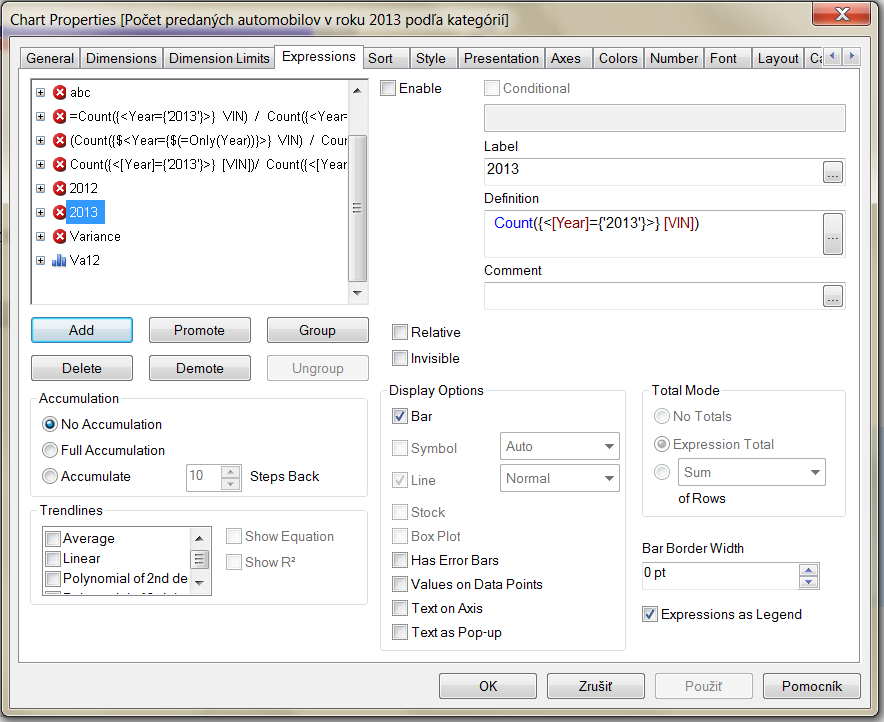
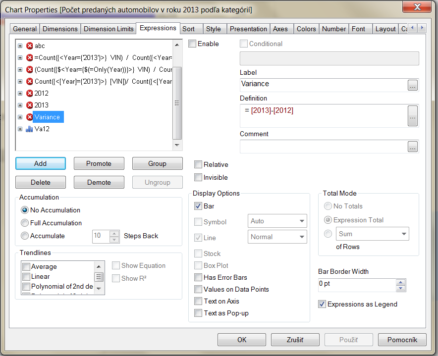
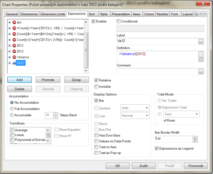
Number is set to Number and show in % 😕
- Mark as New
- Bookmark
- Subscribe
- Mute
- Subscribe to RSS Feed
- Permalink
- Report Inappropriate Content
It's probably because you have disabled all your expressions!
Check 'enable' on [2012], [2013] and [Variance], but then in the 'Display Options' section, untick any options there (e.g. bar / symbol / line) so they don't display on the chart.
Also... I'm still learning myself, but I think you need an extra symbol in your set analysis, i.e.:
Count ( {$<[Year] = {'2013'} >} [VIN] )
- Mark as New
- Bookmark
- Subscribe
- Mute
- Subscribe to RSS Feed
- Permalink
- Report Inappropriate Content
 Yes, that was the problem... Thank you!
Actually It is working also without the extra symbol