Unlock a world of possibilities! Login now and discover the exclusive benefits awaiting you.
- Qlik Community
- :
- All Forums
- :
- QlikView App Dev
- :
- Conditional coloring to line chart based on refere...
- Subscribe to RSS Feed
- Mark Topic as New
- Mark Topic as Read
- Float this Topic for Current User
- Bookmark
- Subscribe
- Mute
- Printer Friendly Page
- Mark as New
- Bookmark
- Subscribe
- Mute
- Subscribe to RSS Feed
- Permalink
- Report Inappropriate Content
Conditional coloring to line chart based on reference line in line chart
Hi,
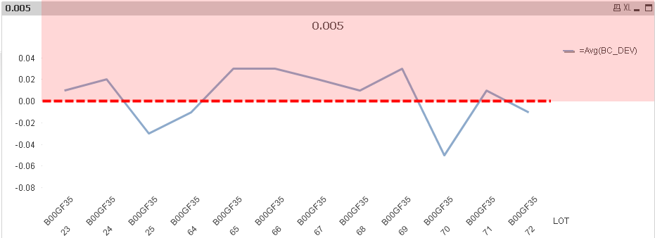
I have a line chart where I am using reference line. what I need to do in chart is Lines which are above reference 0 should be red & lines below should be green. I am attaching a test report so you might get a better idea.
Thanks
- « Previous Replies
-
- 1
- 2
- Next Replies »
Accepted Solutions
- Mark as New
- Bookmark
- Subscribe
- Mute
- Subscribe to RSS Feed
- Permalink
- Report Inappropriate Content
- Mark as New
- Bookmark
- Subscribe
- Mute
- Subscribe to RSS Feed
- Permalink
- Report Inappropriate Content
Hi.
You can't do it directly.
The line and color belongs to the data point (the start of the segment).
The only way is to calculate the middles and add zero point appropriately.
The solution depends on weather you want to use continuous x-axis or not.
- Mark as New
- Bookmark
- Subscribe
- Mute
- Subscribe to RSS Feed
- Permalink
- Report Inappropriate Content
Hi,
Thanks for your reply... Adding zero points will be like adding dummy records which is not a comfortable way to have.
Can we have background of chart like background above 0 will be of red color & below it can be green? Color doesn't matters just distinguishing areas above & below reference lines needed. Any help?
Thanks
- Mark as New
- Bookmark
- Subscribe
- Mute
- Subscribe to RSS Feed
- Permalink
- Report Inappropriate Content
Hi,
You can do something like this
Please find the attached file...

- Mark as New
- Bookmark
- Subscribe
- Mute
- Subscribe to RSS Feed
- Permalink
- Report Inappropriate Content
Or, maybe like this...

- Mark as New
- Bookmark
- Subscribe
- Mute
- Subscribe to RSS Feed
- Permalink
- Report Inappropriate Content
Hi,
Thanks but position of reference line will chages depending on the data.
Ex: depends on customer filter data changes and so position of reference line changes. So I can't go with putting text boxes on background.. Any other workaround?
Thanks
- Mark as New
- Bookmark
- Subscribe
- Mute
- Subscribe to RSS Feed
- Permalink
- Report Inappropriate Content
Hi.
You can try to use a background image with two areas of equal height.
Then set the expressions for Min/Max properly. They should be equal modulo and change dynamically according to the data selected.
- Mark as New
- Bookmark
- Subscribe
- Mute
- Subscribe to RSS Feed
- Permalink
- Report Inappropriate Content
Hi,
Can you please give a sample report ?.. it will give me better understanding.
Thanks
- Mark as New
- Bookmark
- Subscribe
- Mute
- Subscribe to RSS Feed
- Permalink
- Report Inappropriate Content
Hi.
Something like this.
Notice expressions for min and max.
- Mark as New
- Bookmark
- Subscribe
- Mute
- Subscribe to RSS Feed
- Permalink
- Report Inappropriate Content
Hi,
This solution is good when reference axis is not moving .. but with my data reference axis is moving... sometimes if there are all -ve values then reference line appear at top with no +ve values on y-axis.. so this solution has limited scope in my scenario.. Any other suggestion?
- « Previous Replies
-
- 1
- 2
- Next Replies »