Unlock a world of possibilities! Login now and discover the exclusive benefits awaiting you.
- Qlik Community
- :
- All Forums
- :
- QlikView App Dev
- :
- Control Bar width in Bar Chart
- Subscribe to RSS Feed
- Mark Topic as New
- Mark Topic as Read
- Float this Topic for Current User
- Bookmark
- Subscribe
- Mute
- Printer Friendly Page
- Mark as New
- Bookmark
- Subscribe
- Mute
- Subscribe to RSS Feed
- Permalink
- Report Inappropriate Content
Control Bar width in Bar Chart
Hi Experts,
Is there any way to have consistent bar width in bar chart.
Scenario is when the data is shown for all months the bar width is fine but when a particular month is selected the bar width expands.
But my need is to have the consistent bar width irrespective of the number of months selected.
Any help regarding this issue is appreciated.
PS : I have tried using the "Cluster Distance" option in bar settings in presentation tab but no luck.
Regards,
RG
- « Previous Replies
-
- 1
- 2
- Next Replies »
- Mark as New
- Bookmark
- Subscribe
- Mute
- Subscribe to RSS Feed
- Permalink
- Report Inappropriate Content
QV always readjusts the size of bars to fill the plot area. The only way I know of to maintain the width is to plot all bars but color the non-selected bars with a transparent color argb(0,0,0,0)
Attached is an example. It still has the problem of showing labels for extra months, but I'm sure there is a workaround for that.
-Rob
- Mark as New
- Bookmark
- Subscribe
- Mute
- Subscribe to RSS Feed
- Permalink
- Report Inappropriate Content
No, that's not possible afaik without keeping zero bars for the excluded months. The bars will adjust to the available plot space. Less dimension values means more space for each bar, so wider bars.
talk is cheap, supply exceeds demand
- Mark as New
- Bookmark
- Subscribe
- Mute
- Subscribe to RSS Feed
- Permalink
- Report Inappropriate Content
Hi Rob,
Thanks for your reply.
But in this scenario I cannot plot all bars because if only one month is selected then by default there will be a single bar.
Regards,
RG
- Mark as New
- Bookmark
- Subscribe
- Mute
- Subscribe to RSS Feed
- Permalink
- Report Inappropriate Content
Hi Gysbert,
Thanks for your reply.
I concur you on the point.
Still I am looking for any possible workaround.
Regards,
RG
- Mark as New
- Bookmark
- Subscribe
- Mute
- Subscribe to RSS Feed
- Permalink
- Report Inappropriate Content
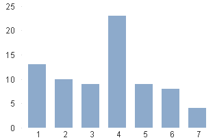
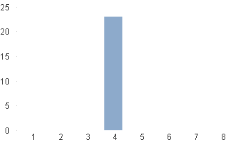
Hi, as said above, to keep the bar widht you must keep also the dimension values, if you don't mind to show month names out of selections you can check the 'Show all values' in the dimension tab and uncheck the 'Supress zero values' in Presentation tab.
In example, with no selections:

Selecting '4':

- Mark as New
- Bookmark
- Subscribe
- Mute
- Subscribe to RSS Feed
- Permalink
- Report Inappropriate Content
Hi Ruben,
Thanks for your reply.
The solution you gave works when Month is the only dimension.
But in my case now I am facing other challenge.
I have two dimensions Month and Year.
Any suggestion on this.
Regards,
RG
- Mark as New
- Bookmark
- Subscribe
- Mute
- Subscribe to RSS Feed
- Permalink
- Report Inappropriate Content
Hi Rob,
there is another way to come to the same result. Look at this:

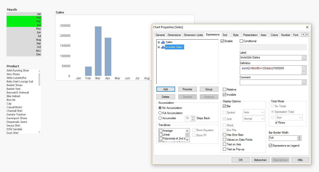
Sales is 'Sum(Sales') and I added a second expression marking 'Invisible' and 'Bar'. Style is 'Stacked'.
The trick is to divide Sum(<Month =>} Sales by a number which is far larger than max(sum(sales)). So you cannot see the contribution of 'Invisible Sales' and the resulting bar looks like 'Grouped'.
Regards
Burkhard
- Mark as New
- Bookmark
- Subscribe
- Mute
- Subscribe to RSS Feed
- Permalink
- Report Inappropriate Content
Hi Rahul,
then you have to use Sum({<Year =, Month=>} Sales)...
Hope this helps
Burkhard
- Mark as New
- Bookmark
- Subscribe
- Mute
- Subscribe to RSS Feed
- Permalink
- Report Inappropriate Content
You can also get rid of the transparent background coloring by using an expression like
=sum(Sales)+sum({1} 0)
and disabling 'suppress zero values' on presentation tab.
- « Previous Replies
-
- 1
- 2
- Next Replies »