Unlock a world of possibilities! Login now and discover the exclusive benefits awaiting you.
- Qlik Community
- :
- All Forums
- :
- QlikView App Dev
- :
- Create a graph of frequency of occurence
- Subscribe to RSS Feed
- Mark Topic as New
- Mark Topic as Read
- Float this Topic for Current User
- Bookmark
- Subscribe
- Mute
- Printer Friendly Page
- Mark as New
- Bookmark
- Subscribe
- Mute
- Subscribe to RSS Feed
- Permalink
- Report Inappropriate Content
Create a graph of frequency of occurence
Hello all,
I've started learning Qlikview on my own just a few days ago. Here's the problem I'm facing; hope someone can help as I've already spent a LONG time trying to figure this out.
I have a data file with the 2 following fields among others:
Purchase ID Customer ID Status
------------------ ------------------ ---------
A392783 123 Active
A323423 555 Active
A392234 123 Cancelled
A392566 195 Active
I want to create a bar graph that shows
Have purchased at least n times in X-Axis, from 1 to 10
No. of customers in Y-Axis
AtLeastNPurchases Count Percentage
------------------ ------------------ ---------
1 16653 100%
2 2000 12%
.
.
.
10 195 1%
Can someone explain to me how I can set this up in Qlikview, please note that I only have very limited knowledge of QV, so please try to be as specific as possible...
Thanks!
- Tags:
- new_to_qlikview
- « Previous Replies
-
- 1
- 2
- Next Replies »
Accepted Solutions
- Mark as New
- Bookmark
- Subscribe
- Mute
- Subscribe to RSS Feed
- Permalink
- Report Inappropriate Content
Hi, John,
To build your desired table, first load some dummy data into a new document.
Load * Inline [
PurchaseID, CustomerID, Status
1,123,Active
2,123,Active
3,123,Active
4,123,Cancelled
5,456,Active
6,456,Active
7,456,Active
8,789,Active
9,987,Active
10,889,Active
];
Next create a new chart. For the chart type select a straight table. This can be turned into a bar chart, but the table may better demonstrate the solution.
In dimensions, add a calculated dimension with the following formula:
=Aggr(count(PurchaseID), CustomerID)
The aggr function builds a new table, split by customerID, with a count of purchases.
Move on to the expressions and add four expressions:
=count (DISTINCT CustomerID)
=Count (TOTAL distinct CustomerID)
=Rangesum(below(count (distinct CustomerID),0,3))
=Rangesum(below(count (distinct CustomerID),0,3)) / count (total distinct CustomerID)
For the last two, change the Total Mode from the default Expression Total to No Totals. You should end up with:
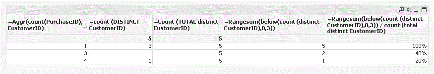
The first expression counts the number of customers for each "At least N orders" row. The second counts the total number of customers across all rows. The third provides a reverse running total, and the last simply divides the third by the second.
To remove the "Cancelled" status orders, easiest way is to create a list box for Status and select only "Active." The alternative is to use set analysis with the above expressions.
- Mark as New
- Bookmark
- Subscribe
- Mute
- Subscribe to RSS Feed
- Permalink
- Report Inappropriate Content
Forgot to mention,what I would like to count for AtLeastNPurchases = 3 (for example), is how many Customer IDs appear on the list 3 times or more, and I wish to count only those transactions where the Status is Active (exclude those where the Status is Cancelled). So obviously AtLeastNPurchases = 1 should be 100%, since all Customer IDs on this list must appear at least once...
- Mark as New
- Bookmark
- Subscribe
- Mute
- Subscribe to RSS Feed
- Permalink
- Report Inappropriate Content
I'm still playing around & trying to figure out a way to do this.
If anyone can help, it would be greatly appreciated!
- Mark as New
- Bookmark
- Subscribe
- Mute
- Subscribe to RSS Feed
- Permalink
- Report Inappropriate Content
Hi, John,
To build your desired table, first load some dummy data into a new document.
Load * Inline [
PurchaseID, CustomerID, Status
1,123,Active
2,123,Active
3,123,Active
4,123,Cancelled
5,456,Active
6,456,Active
7,456,Active
8,789,Active
9,987,Active
10,889,Active
];
Next create a new chart. For the chart type select a straight table. This can be turned into a bar chart, but the table may better demonstrate the solution.
In dimensions, add a calculated dimension with the following formula:
=Aggr(count(PurchaseID), CustomerID)
The aggr function builds a new table, split by customerID, with a count of purchases.
Move on to the expressions and add four expressions:
=count (DISTINCT CustomerID)
=Count (TOTAL distinct CustomerID)
=Rangesum(below(count (distinct CustomerID),0,3))
=Rangesum(below(count (distinct CustomerID),0,3)) / count (total distinct CustomerID)
For the last two, change the Total Mode from the default Expression Total to No Totals. You should end up with:
The first expression counts the number of customers for each "At least N orders" row. The second counts the total number of customers across all rows. The third provides a reverse running total, and the last simply divides the third by the second.
To remove the "Cancelled" status orders, easiest way is to create a list box for Status and select only "Active." The alternative is to use set analysis with the above expressions.
- Mark as New
- Bookmark
- Subscribe
- Mute
- Subscribe to RSS Feed
- Permalink
- Report Inappropriate Content
I didn't fully understand what it is that you are trying to do, but I would look into the Class function. It sounds like that might be what you need:
"Class function is one of the very important functions to achieve a specific metric where you need to create a bucket or range from the given measures. This opens up a whole new way to create new set of dimensions by converting measures into the ranges."
Video:
Create a graph of frequency of occurence
- Mark as New
- Bookmark
- Subscribe
- Mute
- Subscribe to RSS Feed
- Permalink
- Report Inappropriate Content
Hi LastGoodUserNam,
Thank you so much, exactly what I was looking for...
John
- Mark as New
- Bookmark
- Subscribe
- Mute
- Subscribe to RSS Feed
- Permalink
- Report Inappropriate Content
Your method works beautifully.
Would you be so kind as to teach me how I could use set analysis to exclude the records with Status = "Cancelled?
Have tried the list box method of exclusion already and it works, have cross checked the result is correct... But I can't rely on the user to click on Active everytime... Really appreciate if you could teach me how I can include set analysis into the expressions!
- Mark as New
- Bookmark
- Subscribe
- Mute
- Subscribe to RSS Feed
- Permalink
- Report Inappropriate Content
Have managed to get everything to work as intended using the following:
Dimension:
=Aggr(Count(if(Status='Active',[Booking ID])), [Customer ID])
Expressions:
=count ({$<Status={'Active'}>} DISTINCT [Customer ID])
=Count ({$<Status={'Active'}>} TOTAL distinct [Customer ID])
=Rangesum(below(count ({$<Status={'Active'}>} distinct [Customer ID]),0,18))
=Rangesum(below(count ({$<Status={'Active'}>} distinct [Customer ID]),0,18)) / count ({$<Status={'Active'}>} total distinct [Customer ID])
By the way, I had to change the last parameter for the Rangesum from 3 in your suggestion to 18 (through trial and error), if I use a smaller number it gives me incorrect result, any idea why's that?
If you don't mind me asking, any way I can group the values on the X-axis, to say,
1,2,3,4,5,6,7,8,9,"10+"?
- Mark as New
- Bookmark
- Subscribe
- Mute
- Subscribe to RSS Feed
- Permalink
- Report Inappropriate Content
The 3 belongs to the "Below" function, not the Rangesum. Sorry, should have mentioned that might need to be changed. The 18 is parameter n. Per the help:
"By specifying a third parameter n greater than 1, the function will return not one but a range of n values, one for each of n table rows counting downwards from the original cell."
So it represents the total number of rows to sum.
The easiest way to group the values on the x-axis is to:
1. Open the Chart Properties.
2. Go to the Dimension Limits tab.
3. Make sure your calculated dimension is selected on the left. On the right check "Restrict which values are displayed using the first expression."
4. Check "Show Only," change to first, and then enter 9 in the values box.
5. Go down and check the "Show Others" box. In the label enter "10+."
- Mark as New
- Bookmark
- Subscribe
- Mute
- Subscribe to RSS Feed
- Permalink
- Report Inappropriate Content
Forgot to mention, you had stated you can't rely on the user to click on Active every time. You can set a macro to automatically select Active on document/sheet load. This may not be what you want (may confuse users), but thought I'd mention it as an option.
- « Previous Replies
-
- 1
- 2
- Next Replies »