Unlock a world of possibilities! Login now and discover the exclusive benefits awaiting you.
- Qlik Community
- :
- All Forums
- :
- QlikView App Dev
- :
- Creating Chart with CSV DATA
- Subscribe to RSS Feed
- Mark Topic as New
- Mark Topic as Read
- Float this Topic for Current User
- Bookmark
- Subscribe
- Mute
- Printer Friendly Page
- Mark as New
- Bookmark
- Subscribe
- Mute
- Subscribe to RSS Feed
- Permalink
- Report Inappropriate Content
Creating Chart with CSV DATA
Hi,
I'm a beginner at QlikView and this community. I'm not sure Layout & Visualization is a right place to post this question, but I have to start somewhere...
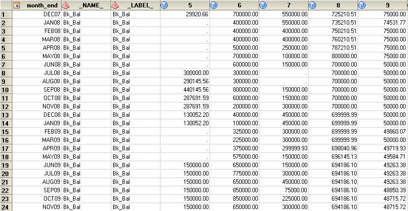
I'm trying to make a simple bar/line chart with the dataset shown below.The dataset was initially created on SAS, and I tried to export it as an Excel file without success because it had over 8,900 columns. I exported it as CSV and imported it to QlikView; however when I tried to make a chart, New Sheet Subject didn't show any dimension to add. I want month_end to be the dimension. Any suggestion on how to go about it?

- Mark as New
- Bookmark
- Subscribe
- Mute
- Subscribe to RSS Feed
- Permalink
- Report Inappropriate Content
Hi Daegu,
First, you call your flat file (or csv), for instance:
1. SET ThousandSep=',';
2...
...
10 SET DayNames='Mon;Tue;Wed;Thu;Fri;Sat;Sun';
11
12
Directory;
LOAD Field1, Field2,... FieldN FROM [path\filename.csv]
After that, your need reload your qlikview file in the follow button:

- Mark as New
- Bookmark
- Subscribe
- Mute
- Subscribe to RSS Feed
- Permalink
- Report Inappropriate Content
Creating a chart video:
- Mark as New
- Bookmark
- Subscribe
- Mute
- Subscribe to RSS Feed
- Permalink
- Report Inappropriate Content
8900 columns may be too much of a good thing. For one it suggest that your data is not in best layout. I've created a test document (comm98433_2.qvw) with 10000 columns and only 10 rows. It's painfully slow.
I also did not manage to create a chart using New Sheet Object -> Chart from either the Layout menu of the context menu of the sheet. The create chart dialog will open, but the Finish button always stayed disabled. A workaround is creating a chart using the Quick Chart Wizard from the Tools menu. It doesn't matter much what you choose here. The purpose is to get any chart at all. Once you've got that you can use the chart properties window to customize it by changing the chart type, replacing or adding dimensions and expressions etc.
After using the CrossTable function to transform the date into a more conventional form I get a smaller and far better performing document (comm98433_3.qvw). This suggest that you should investigate transforming your data too. Or load a far smaller number of columns.
talk is cheap, supply exceeds demand