Unlock a world of possibilities! Login now and discover the exclusive benefits awaiting you.
- Qlik Community
- :
- All Forums
- :
- QlikView App Dev
- :
- Creating Chart with multiple display in X-axis
- Subscribe to RSS Feed
- Mark Topic as New
- Mark Topic as Read
- Float this Topic for Current User
- Bookmark
- Subscribe
- Mute
- Printer Friendly Page
- Mark as New
- Bookmark
- Subscribe
- Mute
- Subscribe to RSS Feed
- Permalink
- Report Inappropriate Content
Creating Chart with multiple display in X-axis
Hi,
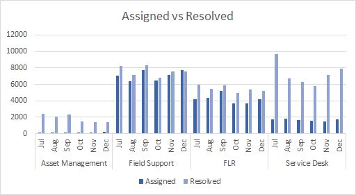
I'm looking to create a chart having comparison of number of tickets Assigned vs. Resolved over time (please see below graph, done in excel.)
Number of tickets Resolved = Count of tickets by Last Resolved Date.
Number of tickets Assigned = Count of tickets by Submit Date
X-axis contains:
- Months
- Teams Names
Could someone please help me with the expressions and the best way to go about it?
Waiting with anticipation for your advice.
Best Regards,
Tony
Accepted Solutions
- Mark as New
- Bookmark
- Subscribe
- Mute
- Subscribe to RSS Feed
- Permalink
- Report Inappropriate Content
Guys,
I have finally been able to solve this!
A part of the solution is
- Using Trellis chart as mentioned above by Jonathan and Raju.
- To get the desired bars for two different dates along a neutral date axis is described beautifully by hic in the link Canonical Date
Remember to convert the date to integer format (ie. with no fractions) when date is the KEY field for linking two tables. Why don’t my dates work?
Happy Qliking! 
Best Regards,
Tony
- Mark as New
- Bookmark
- Subscribe
- Mute
- Subscribe to RSS Feed
- Permalink
- Report Inappropriate Content
Hi
I dont think you can do that directly. There are two options that come to mind:
- Create a trellis chart - this will automatically create 4 charts that can be arranged in a row or in a grid
- Create 4 charts using set analysis to select the values for each group. These could be manually arranged or placed in a container object
You could hide the legend on each chart and then create another chart and re-arrange (using Shift-Ctrl click/drag) this one so that only the legend shows - so you only have one legend for all four charts
HTH
Jonathan
- Mark as New
- Bookmark
- Subscribe
- Mute
- Subscribe to RSS Feed
- Permalink
- Report Inappropriate Content
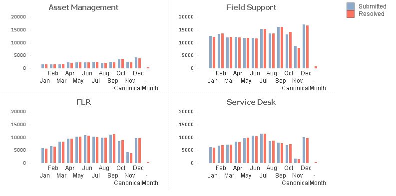
Hi Tony,
You may use trellis chart for this requirement but it will not give exactly same look and it will give similar look like below chart.
Rgds,
Raju

- Mark as New
- Bookmark
- Subscribe
- Mute
- Subscribe to RSS Feed
- Permalink
- Report Inappropriate Content
Hello Jonathan and Raju,
Really appreciate your inputs. Got me thinking on those lines now.
While working on the Trellis chart I'm facing this issue:
How to have two expressions side by side (two bars - count of assigned and count of resolved) as against a single bar?
Best Regards,
Tony
- Mark as New
- Bookmark
- Subscribe
- Mute
- Subscribe to RSS Feed
- Permalink
- Report Inappropriate Content
Hi Tony,
Write these two expressions and make it sub type as grouped in style tab.
Regards,
Raju
- Mark as New
- Bookmark
- Subscribe
- Mute
- Subscribe to RSS Feed
- Permalink
- Report Inappropriate Content
Hi Raju, Jonathan,
Since I have two different date category (submit date and resolved date) as dimension,this is not working (giving me the same count)
I have just come across this link which throws light on resolving this problem, however this looks a bit high level for me. While i try to achieve as explained in the link, it would be great if you could explain the same thing in a more simple way for me to understand and implement.
http://community.qlik.com/blogs/qlikviewdesignblog/2014/02/17/canonical-date
Awaiting with anticipation.
Best Regards,
Tony
- Mark as New
- Bookmark
- Subscribe
- Mute
- Subscribe to RSS Feed
- Permalink
- Report Inappropriate Content
Guys,
I have finally been able to solve this!
A part of the solution is
- Using Trellis chart as mentioned above by Jonathan and Raju.
- To get the desired bars for two different dates along a neutral date axis is described beautifully by hic in the link Canonical Date
Remember to convert the date to integer format (ie. with no fractions) when date is the KEY field for linking two tables. Why don’t my dates work?
Happy Qliking!
Best Regards,
Tony