Unlock a world of possibilities! Login now and discover the exclusive benefits awaiting you.
- Qlik Community
- :
- All Forums
- :
- QlikView App Dev
- :
- Re: Datapoint Label color
- Subscribe to RSS Feed
- Mark Topic as New
- Mark Topic as Read
- Float this Topic for Current User
- Bookmark
- Subscribe
- Mute
- Printer Friendly Page
- Mark as New
- Bookmark
- Subscribe
- Mute
- Subscribe to RSS Feed
- Permalink
- Report Inappropriate Content
Datapoint Label color
Hello,
Do you know how I can change the color of the Labels on Datapoints in a Scatter Chart ? By default they are black and I want them to be red.
thanks.
dani
- Tags:
- new_to_qlikview
- Mark as New
- Bookmark
- Subscribe
- Mute
- Subscribe to RSS Feed
- Permalink
- Report Inappropriate Content
Hi,
For which color of the labels are you asking can you provide any snap shot of that one.
Thanks & Regards
- Mark as New
- Bookmark
- Subscribe
- Mute
- Subscribe to RSS Feed
- Permalink
- Report Inappropriate Content
Hi Dani,
You have to click on "Font" button in the axes tab of your object's properties.
Like in this picture :
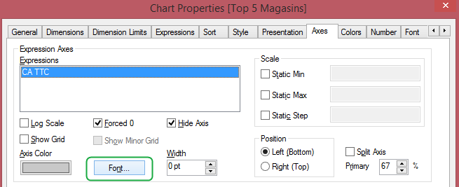
And then, change the font color from black to red.
Hope that helps you
Martin Favier
- Mark as New
- Bookmark
- Subscribe
- Mute
- Subscribe to RSS Feed
- Permalink
- Report Inappropriate Content
Hi,
attached a sample. I want the a1, a2, a3, ... to be in red (I mean the text to be in red). Then b1, b2, b3,... to be colored in blue, and so on
thks,dani
- Mark as New
- Bookmark
- Subscribe
- Mute
- Subscribe to RSS Feed
- Permalink
- Report Inappropriate Content
Hi Martin. It does not work in a scatter chart. see the QV attachment in my previous post...
thks,dani
- Mark as New
- Bookmark
- Subscribe
- Mute
- Subscribe to RSS Feed
- Permalink
- Report Inappropriate Content
HI Dani,
I've you found a solution to your problem ?
I'm faced the same issue and could not find any solution.
Regards. Guy
- Mark as New
- Bookmark
- Subscribe
- Mute
- Subscribe to RSS Feed
- Permalink
- Report Inappropriate Content
Hi Guy,
I'm sorry but I couldn't figure out any solution for this question...
Thanks,
dani
- Mark as New
- Bookmark
- Subscribe
- Mute
- Subscribe to RSS Feed
- Permalink
- Report Inappropriate Content
Hi,
As MArtin FAVIER said, to change the color is in Axes sheet... but you have another mistake, in dimensions (I don't know why) you have a Text color with a symbol "=" (in two dimensions, Model & Type), you have to delete them and add again because there are something (a bug) to keep this formula even you delete it.
So just add again your dimensions and change color in Axes sheet. See your QVW.
Best Regards.
- Mark as New
- Bookmark
- Subscribe
- Mute
- Subscribe to RSS Feed
- Permalink
- Report Inappropriate Content
Hi Owaldo,
I don't want to be all colored in blue but in different colors based on the company. So I want the a1, a2, a3, ... to be in red (I mean the text to be in red). Then b1, b2, b3,... to be colored in blue, and so on.
Thanks,
dani
- Mark as New
- Bookmark
- Subscribe
- Mute
- Subscribe to RSS Feed
- Permalink
- Report Inappropriate Content
Hello, Dani!
I've faced this problem too. You can change the color for lables by setting an X Axis color on Axes tab. It will change the color both for the axis and for the labels. Unfortunately you can't set diffetent colors to the labels.