Unlock a world of possibilities! Login now and discover the exclusive benefits awaiting you.
- Qlik Community
- :
- All Forums
- :
- QlikView App Dev
- :
- Different color in legend than in graph
- Subscribe to RSS Feed
- Mark Topic as New
- Mark Topic as Read
- Float this Topic for Current User
- Bookmark
- Subscribe
- Mute
- Printer Friendly Page
- Mark as New
- Bookmark
- Subscribe
- Mute
- Subscribe to RSS Feed
- Permalink
- Report Inappropriate Content
Different color in legend than in graph
Hi all,
i am new to QV and i need your help again:
I want to distinguish the weekend days "saturday" and "sunday".
In the formula for the summary -> backround color i put in this definition: if (fieldweekday ='sunday', LightRed())
It works fine for the graph but not for the legend!
Every line color is red and it seems the color of the weekendday is applied.
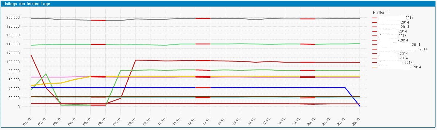
Here is the example (see right side):
Any Idea?
thanks and best regards,
Sabrina
- Mark as New
- Bookmark
- Subscribe
- Mute
- Subscribe to RSS Feed
- Permalink
- Report Inappropriate Content
To do this i usually create an additional expression the same as your dimension fieldweekday and for it :
- Untick <Line>
- Tick <Text on Axis]
- Set its background colour expression as needed.
And for the dimension leave as is, except unticking <Label>
- Mark as New
- Bookmark
- Subscribe
- Mute
- Subscribe to RSS Feed
- Permalink
- Report Inappropriate Content
Hi,
if you want to really have control over the colors of your chart and legend, you will have to deactivate the automatic legend (checkbox) and put in some free_text_boxes instead (on the "presentation" tab). That is kind of fickle and time-consuming because you have to position every such box - one coloured without text and one with text beside that - manually. Put the zoom to 200 or 400 % to get that right.
HTH
Best regards,
DataNibbler
- Mark as New
- Bookmark
- Subscribe
- Mute
- Subscribe to RSS Feed
- Permalink
- Report Inappropriate Content
Thanks!
Do you have any screenshots ory example?
fieldweekday is a field of a table. The dimensions are DDMM and PlattformLastYear and the expression (formula) is [article online].
regards,
Sabrina
- Mark as New
- Bookmark
- Subscribe
- Mute
- Subscribe to RSS Feed
- Permalink
- Report Inappropriate Content
Sabrina
Do try following the bullet point advice I have given.
If you have any problems then feel free to ask and / or post a sample qvw.
Bill