Unlock a world of possibilities! Login now and discover the exclusive benefits awaiting you.
- Qlik Community
- :
- All Forums
- :
- QlikView App Dev
- :
- Dimension problem in chart
- Subscribe to RSS Feed
- Mark Topic as New
- Mark Topic as Read
- Float this Topic for Current User
- Bookmark
- Subscribe
- Mute
- Printer Friendly Page
- Mark as New
- Bookmark
- Subscribe
- Mute
- Subscribe to RSS Feed
- Permalink
- Report Inappropriate Content
Dimension problem in chart
Hi guys,
I've create a chart that shows Clients on the x-axis. My problem is that i have over 5 000 clients and i need at least half of them to be represented in the chart. I've sorted them descending based on the total of sales. Now... i also have a realtive line showing which clients that represents 80% of total sales. And the problem is that i can't see the 80% clients all in one chart without scrolling.
Is there any way i can solve this? I need to have all of them visible at fist sight so to speak.
Thanks in advance!
//A .
- Tags:
- chart
- Mark as New
- Bookmark
- Subscribe
- Mute
- Subscribe to RSS Feed
- Permalink
- Report Inappropriate Content
Buy a wider Screen? 
Have you tried to turn the chart by 90%? Even then you will not see some 4000 different entries.
Usually it make more sense to show clients in a kind of ABC-analysis and drop the details into a normal table for further handling in Excel or the like.
Peter
- Mark as New
- Bookmark
- Subscribe
- Mute
- Subscribe to RSS Feed
- Permalink
- Report Inappropriate Content
You sound to have a fundemental problem here - thousands of dimensional values all visable at the same time; that's physically impossible for Qlikview or any other form of graphical representation; you simply can't make a chart that would be readable within the size contraints.
I'd look to question why you need to see so many at once; if someone is looking for a certain value they won't see it as there'll be too many other values confusing the issue. You could look to group values together and provide a drill-down or selection boxes to get to the data required, if you do need to get them all on one view you might be able to create a Block Chart but again it won't be readily usable due to the amount of information you're trying to convey. Failing that a standard Straight table may be your best bet; but in my opinion you need to either avoid a graphical representation or add a scroll-bar to your chart.
Sorry I can't be of more assistance but trying to get that volume of dimensional data represented in a readable, graphical manner is impossible.
All the best,
Matt - Visual Analytics Ltd
- Mark as New
- Bookmark
- Subscribe
- Mute
- Subscribe to RSS Feed
- Permalink
- Report Inappropriate Content
Hi,
I agree that a straight table is the best choice here but my customer really wants to se the visualisation of it.
@prieper: what do you mean when you say "turn the chart 90%". And also, this ABC-analysis, sounds like something i need to know(?).
Thanks both of you for your input!
//A.
- Mark as New
- Bookmark
- Subscribe
- Mute
- Subscribe to RSS Feed
- Permalink
- Report Inappropriate Content
One idea is to have a straight table with all customers with their values in a vertical order,
alternatively (but useless for so many different dimensions) you may create a barchart, but with a vertical orientation, like
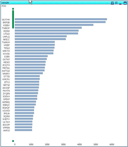
Such a display increases readability and gives a good impression on the magnitude of values
HTH
Peter