Unlock a world of possibilities! Login now and discover the exclusive benefits awaiting you.
- Qlik Community
- :
- All Forums
- :
- QlikView App Dev
- :
- Re: Display values on line chart
- Subscribe to RSS Feed
- Mark Topic as New
- Mark Topic as Read
- Float this Topic for Current User
- Bookmark
- Subscribe
- Mute
- Printer Friendly Page
- Mark as New
- Bookmark
- Subscribe
- Mute
- Subscribe to RSS Feed
- Permalink
- Report Inappropriate Content
Display values on line chart
Hi everybody,
I have a line chart with an x-axis time series (which is updated every month with the latest information) and an y-axis with sales values.
The user can select the shop for viewing line chart of its sales value during the month.
Furthermore, each store is associated with events such as openings of competitors whose date is expressed in months like sales values.
I want to show these events with a symbol placed in the month in which it happened at the sales level (plus a million not to overlap the line) of the store of that month.
With this function:
=if(inmonth([DATA IMPATTO],Data,0)=-1,sum(Vendite_AM)+1000000)
where:
DATA IMPATTO is the date of the event (month)
Data is the date of the sales values (month)
Vendite_AM is the sales values
I can display the symbol only if there is a singol event.
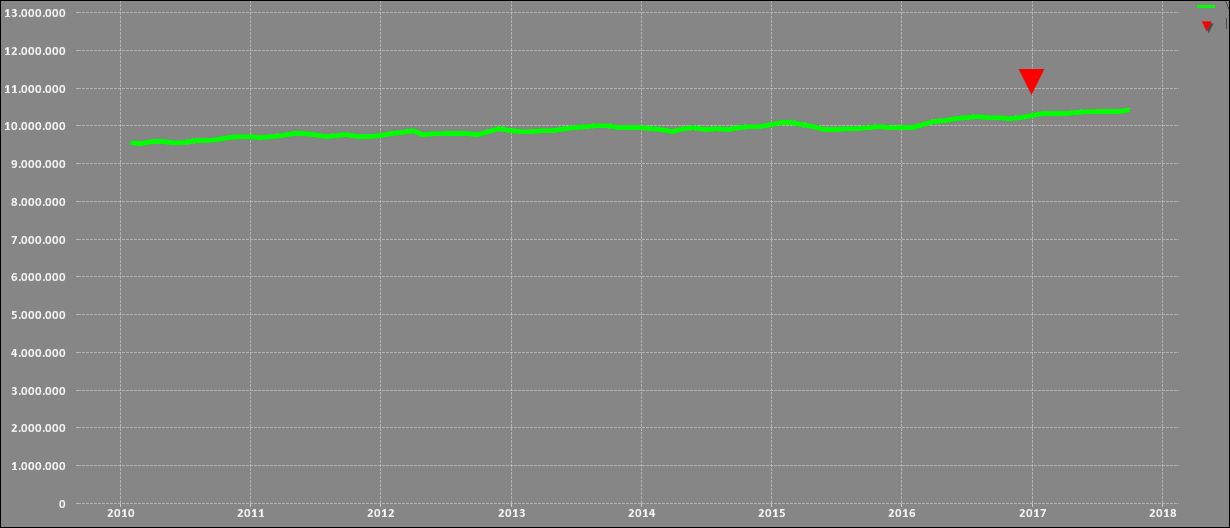
If I have more than one event associated to one shop I cannot display anything on the graph, just the line.
How can I do it?
- « Previous Replies
-
- 1
- 2
- Next Replies »
- Mark as New
- Bookmark
- Subscribe
- Mute
- Subscribe to RSS Feed
- Permalink
- Report Inappropriate Content
the first function you post works, but it shows all the events, regardless of the filter in the list box of stores.
- Mark as New
- Bookmark
- Subscribe
- Mute
- Subscribe to RSS Feed
- Permalink
- Report Inappropriate Content
Hi guys, i've found the answer. I write to let you know.
Not if(sum( but sum(if( ...
The function I've used is:
=avg(if(inmonth([DATA IMPATTO],Data,0)=-1,Vendite_AM))
I replaced sum with avg because, if I have for example 3 events in the same date the symbol is displayed on sum(Vendite_AM) * 3
- « Previous Replies
-
- 1
- 2
- Next Replies »