Unlock a world of possibilities! Login now and discover the exclusive benefits awaiting you.
- Qlik Community
- :
- All Forums
- :
- QlikView App Dev
- :
- Fix chart misalignment?
- Subscribe to RSS Feed
- Mark Topic as New
- Mark Topic as Read
- Float this Topic for Current User
- Bookmark
- Subscribe
- Mute
- Printer Friendly Page
- Mark as New
- Bookmark
- Subscribe
- Mute
- Subscribe to RSS Feed
- Permalink
- Report Inappropriate Content
Fix chart misalignment?
Hello!! Could anyone help me with the following?
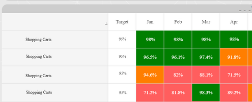
We have a chart that from QlikView desktop looks misaligned but once deployed to the access point looks fine:
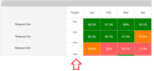
However, some users report that sometimes the chart will look like this:
We are all using the same computers with the same software. To some colleagues it looks fine but to others it appears like that. Even more strange, sometime the chart will look fine to the users but when they interact with it, it shifts.
Any ideas why this may be happening and how it can be resolved? We have other similar charts and we dont experience such issues.
It's important to mention that the targets are actually text objects (seperate from the straight table) with formulas to pull those values.
Thanks!!!
---------------------------------------------------------------
Other details:
QlikView 12
Google Chrome/ Microsoft Edge Chromium
Windows 10
Accepted Solutions
- Mark as New
- Bookmark
- Subscribe
- Mute
- Subscribe to RSS Feed
- Permalink
- Report Inappropriate Content
I think there are various causes possible - most likely are different resolutions from the screen (in absolut or through the windows scale), the available screen (menu bars and similar), different browser settings and/or addons ...
I suggest to go another way and to remove the textboxes and to integrate the target within the table.
- Marcus

