Unlock a world of possibilities! Login now and discover the exclusive benefits awaiting you.
- Qlik Community
- :
- All Forums
- :
- QlikView App Dev
- :
- Functionality in scatter chart
- Subscribe to RSS Feed
- Mark Topic as New
- Mark Topic as Read
- Float this Topic for Current User
- Bookmark
- Subscribe
- Mute
- Printer Friendly Page
- Mark as New
- Bookmark
- Subscribe
- Mute
- Subscribe to RSS Feed
- Permalink
- Report Inappropriate Content
Functionality in scatter chart
Hi All,
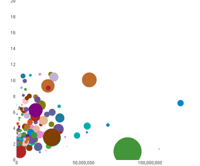
I have a question in regards to the functionality of a chart in QlikView, I have the following chart below.
I was wondering if it is possible to assign specific shapes to the bubbles based on the size of the bubble? So for example, a large bubble would now be a regular sized triangle and a smaller bubble may remain a bubble but the same size as the triangle. So essentially, all shaped would be the same size, but would vary based on the shape instead of the size.
In addition, is it possible to make four charts from this one chart and break them down based on quadrants? So an end user would be able to toggle to only see the lower left quadrant based on set parameters, or they could also choose to look at the upper left quadrant based on a different set of parameters?
Can this be done within QlikView? Or has anyone actually been able to implement it into one of their applications?
Thank you!
Rose
- Mark as New
- Bookmark
- Subscribe
- Mute
- Subscribe to RSS Feed
- Permalink
- Report Inappropriate Content
Hi Rose,
I don't think it's possible with the standard Scatter plot. You might find some extensions.
Out of curiosity where this requirement is coming from? Why would you want to have different shapes for different sizes?
Sergey
- Mark as New
- Bookmark
- Subscribe
- Mute
- Subscribe to RSS Feed
- Permalink
- Report Inappropriate Content
The bubbles itself could be only replaced on a object respectively global level but not depending on any dimension values or measures - and I doubt that it would be really an improvement because there are the possibilities to adjust the size and the color of the bubbles and adding more information into a general rather complex chart would be rather confusing and not an added value.
But the other points are viable whereby I think it needs a change in the logic not to distribute the values based on absolute measures else against relative ones. This might be percentages or any other kinds of quotas. Personally I'm not sure if it would be possible / sensible to use several charts for it else it could be done in a single chart and the quadrants could be realized with an additionally expression and a fixed line (bottom right in tab presentation).
After all it might be look like:
and measured by us the current performance against the average performance of the last n months and against the (total) average of the current forecast.
I hope it gives you some ideas ...
- Marcus

