Unlock a world of possibilities! Login now and discover the exclusive benefits awaiting you.
- Qlik Community
- :
- All Forums
- :
- QlikView App Dev
- :
- Graph and dynamic lines
- Subscribe to RSS Feed
- Mark Topic as New
- Mark Topic as Read
- Float this Topic for Current User
- Bookmark
- Subscribe
- Mute
- Printer Friendly Page
- Mark as New
- Bookmark
- Subscribe
- Mute
- Subscribe to RSS Feed
- Permalink
- Report Inappropriate Content
Graph and dynamic lines
Hi
I'm trying to add to an average line per each year (2010 and 2011) to the bar chart. The average line is based on a calculation and thus I can not use the trend line as an option. I need to obtain two lines. I could always force the line to be a static number but that would not be ideal, as I would have to remember changing those numbers each time I run an update. I would like it to be dynamic.
I need to show those lines as the users would like to see themselves against the industry average.
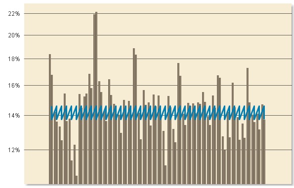
Currently the graph I get is as seen below:
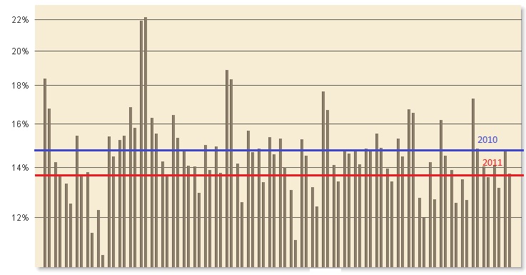
Ultimately, I would like to obtain the following graph:
Please could someone help me in my plight.
Thanks
Ania
Accepted Solutions
- Mark as New
- Bookmark
- Subscribe
- Mute
- Subscribe to RSS Feed
- Permalink
- Report Inappropriate Content
Go to chart properties then presentation panel.
You can add refernce lines with an expression, color, ...
JJ
- Mark as New
- Bookmark
- Subscribe
- Mute
- Subscribe to RSS Feed
- Permalink
- Report Inappropriate Content
Go to chart properties then presentation panel.
You can add refernce lines with an expression, color, ...
JJ
- Mark as New
- Bookmark
- Subscribe
- Mute
- Subscribe to RSS Feed
- Permalink
- Report Inappropriate Content
Thanks JJ
It's works exactly like I wanted. 
Regards
Ania