Unlock a world of possibilities! Login now and discover the exclusive benefits awaiting you.
- Qlik Community
- :
- All Forums
- :
- QlikView App Dev
- :
- Graph help
- Subscribe to RSS Feed
- Mark Topic as New
- Mark Topic as Read
- Float this Topic for Current User
- Bookmark
- Subscribe
- Mute
- Printer Friendly Page
- Mark as New
- Bookmark
- Subscribe
- Mute
- Subscribe to RSS Feed
- Permalink
- Report Inappropriate Content
Graph help
HI, i need help to create a graph.
This is the problem:
Supouse you have the following table with data:
sell_id SellWeek AnulationWeek Amount
1 1 1 100
2 1 2 200
I want to create a graph with the x-axis with week and the y-axis amount. In the week 1 the amount must be 200, beacuse i sold 300 but i have a anulation of 100, in the second the amount must be -200, because i sold 0 and have 200 of anulation.
Can anyone help me?
Thanks,
- Tags:
- new_to_qlikview
Accepted Solutions
- Mark as New
- Bookmark
- Subscribe
- Mute
- Subscribe to RSS Feed
- Permalink
- Report Inappropriate Content
I added some records
this is the RESULT,see attachment or below for SCRIPT
![2014-03-21 23_37_14-QlikView x64 - [C__Users_mgrossi_Desktop_Z.qvw_].png](/legacyfs/online/55698_2014-03-21 23_37_14-QlikView x64 - [C__Users_mgrossi_Desktop_Z.qvw_].png)
Source:
load * inline [
sell_id, SellWeek, AnulationWeek, Amount
1 , 1 , 1 , 100
2 , 1 , 2 , 200
3 , 4 , 3 , 100
4 , 5 , 4 , 200
];
L:
load
SellWeek as Week,
1 as Type,
sell_id
resident Source;
load
AnulationWeek as Week,
-1 as Type,
sell_id
resident Source;
- Mark as New
- Bookmark
- Subscribe
- Mute
- Subscribe to RSS Feed
- Permalink
- Report Inappropriate Content
Can you elaborate AnulationWeek ?
Dont understood your requirements fully...:-(
- Mark as New
- Bookmark
- Subscribe
- Mute
- Subscribe to RSS Feed
- Permalink
- Report Inappropriate Content
AnulationWeek, is the week when a sell is canceled. Imagine that each row represents a reservation for a flight. And you can cancel that reservation, that is what AnulationWeek means..
- Mark as New
- Bookmark
- Subscribe
- Mute
- Subscribe to RSS Feed
- Permalink
- Report Inappropriate Content
Got it, Can you provide 4-5 more sample lines to work?
- Mark as New
- Bookmark
- Subscribe
- Mute
- Subscribe to RSS Feed
- Permalink
- Report Inappropriate Content
In the image below its and example in excel.
If Anulationweek=1000 then de anulation week is null, the reservation is available.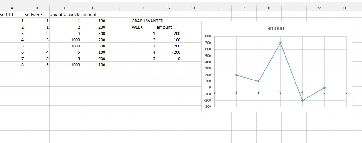
- Mark as New
- Bookmark
- Subscribe
- Mute
- Subscribe to RSS Feed
- Permalink
- Report Inappropriate Content
I added some records
this is the RESULT,see attachment or below for SCRIPT
Source:
load * inline [
sell_id, SellWeek, AnulationWeek, Amount
1 , 1 , 1 , 100
2 , 1 , 2 , 200
3 , 4 , 3 , 100
4 , 5 , 4 , 200
];
L:
load
SellWeek as Week,
1 as Type,
sell_id
resident Source;
load
AnulationWeek as Week,
-1 as Type,
sell_id
resident Source;
- Mark as New
- Bookmark
- Subscribe
- Mute
- Subscribe to RSS Feed
- Permalink
- Report Inappropriate Content
Thank you!
It works fine