Unlock a world of possibilities! Login now and discover the exclusive benefits awaiting you.
- Qlik Community
- :
- All Forums
- :
- QlikView App Dev
- :
- Grouped dimension fields
- Subscribe to RSS Feed
- Mark Topic as New
- Mark Topic as Read
- Float this Topic for Current User
- Bookmark
- Subscribe
- Mute
- Printer Friendly Page
- Mark as New
- Bookmark
- Subscribe
- Mute
- Subscribe to RSS Feed
- Permalink
- Report Inappropriate Content
Grouped dimension fields
Hi everyone,
Since I'm just starting with QlikView, I don't know how to build a Pie Chart based on the following data:
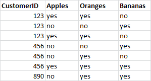
The pie chart should show the distribution in % of the number of different CustomerID eating Apples, Oranges or Bananas.
I tried already with different methods and functions like aggr, dimension grouping (Cyclic) without any successful result.
Thank you for your help!
A.
Accepted Solutions
- Mark as New
- Bookmark
- Subscribe
- Mute
- Subscribe to RSS Feed
- Permalink
- Report Inappropriate Content
Expr:
1. Count({<Apples={'yes'}>}Apples)/Count(distinct CustomerId)
2. Count({<Bananas={'yes'}>}Bananas)/Count(distinct CustomerId)
3. Count({<Oranges={'yes'}>}Oranges)/Count(distinct CustomerId)
- Mark as New
- Bookmark
- Subscribe
- Mute
- Subscribe to RSS Feed
- Permalink
- Report Inappropriate Content
hi
Please check the attached app.
- Mark as New
- Bookmark
- Subscribe
- Mute
- Subscribe to RSS Feed
- Permalink
- Report Inappropriate Content
Thank you anbu and sagar for the useful information! It worked!
I still have two questions:
1. I tried to select one of the expressions direct from the chart, but it didn't nothing and is not interactive like other charts.
2. Since I'm using QlikSense as well, I tried to add the chart there but I was able to add one dimension only.Do you know how this can be developed in QlikSense?
Thank you in advance!
Regards,
A.