Unlock a world of possibilities! Login now and discover the exclusive benefits awaiting you.
- Qlik Community
- :
- All Forums
- :
- QlikView App Dev
- :
- Having total of charts line into the axis?
- Subscribe to RSS Feed
- Mark Topic as New
- Mark Topic as Read
- Float this Topic for Current User
- Bookmark
- Subscribe
- Mute
- Printer Friendly Page
- Mark as New
- Bookmark
- Subscribe
- Mute
- Subscribe to RSS Feed
- Permalink
- Report Inappropriate Content
Having total of charts line into the axis?
Hello,
Is it possible to have a graph with total into the axis like this ( but "0" replace by the total of the line):
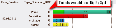
I have 3 dimesions: Date_Creation, Type_Opération_GRP and Type_Opération.
Expressions are:
1- "Nbre Log" =if(inweek(Date_Creation,today(),0) or inweek(Date_Creation,today(),-1), count(distinct ID))
2- "" =sum([Nbre Log]), to have the total on axis with checked box "text on axis"
Thanks in advance for your help
Laurent
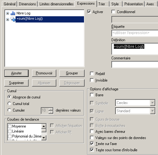
Edit: I've made this in 2nd expression in pop-pup and text on axis:
=sum(distinct if(inweek(Date_Creation,today(),0) or inweek(Date_Creation,today(),-1),aggr(count(total<Type_Opération_GRP,Date_Creation> ID),Type_Opération,Type_Opération_GRP,Date_Creation)))
It works but seems encounter a bug: The obtained value for 1st value of the 3d dimension is repeated for each distinct name of the field on 3d dimension (here "Type_Operation") to others lines an over value. For others, lines there is no duplicate. See screen shot below for example:
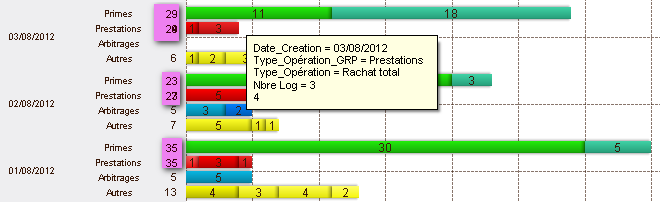
The value in pop-up is good vs "text on axis" (duplicated on other lines for first value)