Unlock a world of possibilities! Login now and discover the exclusive benefits awaiting you.
- Qlik Community
- :
- All Forums
- :
- QlikView App Dev
- :
- Help With Line Chart - plotting line from multiple...
- Subscribe to RSS Feed
- Mark Topic as New
- Mark Topic as Read
- Float this Topic for Current User
- Bookmark
- Subscribe
- Mute
- Printer Friendly Page
- Mark as New
- Bookmark
- Subscribe
- Mute
- Subscribe to RSS Feed
- Permalink
- Report Inappropriate Content
Help With Line Chart - plotting line from multiple fields
How do I create a line graph for data contained in multiple fields ?
I would like to create a line chart with 2 lines (Product A & Product B) plotting the 5 weekly sales buckets.
Product_A, week1,week2,week3,week4,week5
Product_B, week1,week2,week3,week4,week5
Thanks,
Lou
Accepted Solutions
- Mark as New
- Bookmark
- Subscribe
- Mute
- Subscribe to RSS Feed
- Permalink
- Report Inappropriate Content
Gah, that data is in a lousy format. You need to fix the data so your weeks end up in one field and the values in another. You can use the crosstable function for that in the script
Data:
crosstable(Week,Value,1)
load Product, "Week 1", "Week 2", "Week 3", "Week 4", "Week 5"
from ...yoursource...;
That will give you a table like:
Data:
Product, Week, Value
Product A, Week 1, 2
Product A, Week 2, 4
Product A, Week 3, 8
... etc.
Then you can use Week and Product as dimensions and sum(Value) as expression.
talk is cheap, supply exceeds demand
- Mark as New
- Bookmark
- Subscribe
- Mute
- Subscribe to RSS Feed
- Permalink
- Report Inappropriate Content
Use week as your first dimension and product as the second. You'll get a line for every possible product value.
talk is cheap, supply exceeds demand
- Mark as New
- Bookmark
- Subscribe
- Mute
- Subscribe to RSS Feed
- Permalink
- Report Inappropriate Content
What do I put in the Expressions definition?
- Mark as New
- Bookmark
- Subscribe
- Mute
- Subscribe to RSS Feed
- Permalink
- Report Inappropriate Content
max(Koala_Bear_Count) maybe? Sorry, but my mind reading extension broke down. I'm afraid you'll have to tell us what you want to show in your line chart.
talk is cheap, supply exceeds demand
- Mark as New
- Bookmark
- Subscribe
- Mute
- Subscribe to RSS Feed
- Permalink
- Report Inappropriate Content
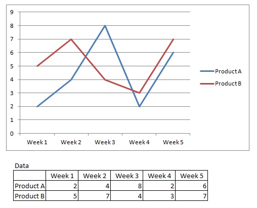
This is the graph I am trying to create.The data fields are
Product_Name, Week_1, Week_2, Week_3, Week_4, Week_5
- Mark as New
- Bookmark
- Subscribe
- Mute
- Subscribe to RSS Feed
- Permalink
- Report Inappropriate Content
Gah, that data is in a lousy format. You need to fix the data so your weeks end up in one field and the values in another. You can use the crosstable function for that in the script
Data:
crosstable(Week,Value,1)
load Product, "Week 1", "Week 2", "Week 3", "Week 4", "Week 5"
from ...yoursource...;
That will give you a table like:
Data:
Product, Week, Value
Product A, Week 1, 2
Product A, Week 2, 4
Product A, Week 3, 8
... etc.
Then you can use Week and Product as dimensions and sum(Value) as expression.
talk is cheap, supply exceeds demand
- Mark as New
- Bookmark
- Subscribe
- Mute
- Subscribe to RSS Feed
- Permalink
- Report Inappropriate Content
The crosstable load was the way to go.
Thanks for your help.