Unlock a world of possibilities! Login now and discover the exclusive benefits awaiting you.
- Qlik Community
- :
- All Forums
- :
- QlikView App Dev
- :
- Re: Help needed with an expression to visualize da...
- Subscribe to RSS Feed
- Mark Topic as New
- Mark Topic as Read
- Float this Topic for Current User
- Bookmark
- Subscribe
- Mute
- Printer Friendly Page
- Mark as New
- Bookmark
- Subscribe
- Mute
- Subscribe to RSS Feed
- Permalink
- Report Inappropriate Content
Help needed with an expression to visualize data into a line chart
In my line chart i have to use Dimensions as 00 hr, 1 hr, 2 hr, 3hr etc.
Struggling to figure out what expression i use to display on x-axis these hours 00, 1hr, 2hr etc
On Y-Axis i want to display Test_KPI but only when it is equal to = DownloadRate [KBits/s]
So the expectation is that if i manage to plot this, there will be a distint value for DownloadRate at each hour
Another complexity is to add the name of the TG Operator this belongs to.
Hope the question is clear.
Thanks for the help in advance!!
- Tags:
- qlikview_scripting
Accepted Solutions
- Mark as New
- Bookmark
- Subscribe
- Mute
- Subscribe to RSS Feed
- Permalink
- Report Inappropriate Content
Your load script will be as below.
Crosstable(ColumnName,Value,16)
Load .....,
Avg,
IXP..,
KPI.
From xyz;
Then remove the KPI,Avg... and unwanted fields from that, which will eventually keep only hours, which is what you need.
- Mark as New
- Bookmark
- Subscribe
- Mute
- Subscribe to RSS Feed
- Permalink
- Report Inappropriate Content
Hi, You must first convert your crosstable structure to Normal Table using the Crosstab function.
Check more help in below link.
Once you do that It will be easy for you to show that information in line chart.
- Mark as New
- Bookmark
- Subscribe
- Mute
- Subscribe to RSS Feed
- Permalink
- Report Inappropriate Content
Hi Kaushik
Thanks for that great suggestion. I did apply the Crosstable structure and the data looks much more simpler to handle for graphing.
This is the format of my raw data:
And this is my Load script:
Crosstable(Hour,KPI_Value,4)
LOAD
KPI as KPI_Name,
Country as Test_Country,
Operator as Test_Operator,
*
FROM
[E:\Qlikview\RT\IPX_SYN2.xlsx]
(ooxml, embedded labels, table is [Sigos Speed Test Pre]);
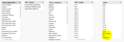
The output data now looks like the below and very close to what i need, however just take a note of the last 4 values in the Hour table (avg, IPX Routing, KPI and Operator), how do i get rid of these values and only have hours from 00 till 12:
- Mark as New
- Bookmark
- Subscribe
- Mute
- Subscribe to RSS Feed
- Permalink
- Report Inappropriate Content
Your load script will be as below.
Crosstable(ColumnName,Value,16)
Load .....,
Avg,
IXP..,
KPI.
From xyz;
Then remove the KPI,Avg... and unwanted fields from that, which will eventually keep only hours, which is what you need.
- Mark as New
- Bookmark
- Subscribe
- Mute
- Subscribe to RSS Feed
- Permalink
- Report Inappropriate Content
Thanks Mate
i just had to replace 16 with 8 and it worked like a charm. Thank you.


