Unlock a world of possibilities! Login now and discover the exclusive benefits awaiting you.
- Qlik Community
- :
- All Forums
- :
- QlikView App Dev
- :
- Help with Bubble Chart
- Subscribe to RSS Feed
- Mark Topic as New
- Mark Topic as Read
- Float this Topic for Current User
- Bookmark
- Subscribe
- Mute
- Printer Friendly Page
- Mark as New
- Bookmark
- Subscribe
- Mute
- Subscribe to RSS Feed
- Permalink
- Report Inappropriate Content
Help with Bubble Chart
Hi folks,
Need some advice.
I want to get a bubble chart with:
X-axis - Customer Group
Y-axis - average profitabilty of Customer Group (i.e. 0.14)
Bubble - Sum of gross sales
I set my dimensions as Customer Group and Avg(Gross) and expressions as Sum(Gross), but I have an error message for my calculated dimension (avg(gross)). any ideas ?
Thanks,
Mikhail
- Mark as New
- Bookmark
- Subscribe
- Mute
- Subscribe to RSS Feed
- Permalink
- Report Inappropriate Content
Hi, Mikhail,
please, what does the error message say?
Greetings from Munich
Martina
EVACO GmbH
- Mark as New
- Bookmark
- Subscribe
- Mute
- Subscribe to RSS Feed
- Permalink
- Report Inappropriate Content
Mikhail,
I'd suggest that type of chart isn't best suited to a Bubble / Scatter Chart (at least as you describe) as you have a non-continuous dimension (Customer Group).
Personally I'd use a combo chart with X as Customer Group and both Avg Profitability and Sales as the Y values, I'd use a bar to display the Sales (as your X dimension is non-contiguous and therfore each value bears no relation to the next so they shouldn't beconnected by a line chart) and Symbols to display tghe Avg Profitability, you'll need to split the Axis in 2; Sales on the left, Profitability on the right.
I use Scatter and Bubble charts where I have one dimension (Customer Group) and 2 axis expressions (sum of Sales and Count of Volume - your example has 1 dimension, 1 axis expression and 1 size expression) as in the example below:
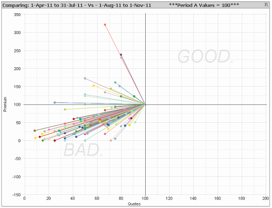
We have 'Quotes' across the X-Axis and 'Premium' across the Y-Axis, the bubbles are split by 'Product Type' (there is no size expression as it's not needed).
As a rule; the X and Y axis of a scatter chart should always be continuous.
Hope that helps,
Matt - Visual Analytics Ltd
- Mark as New
- Bookmark
- Subscribe
- Mute
- Subscribe to RSS Feed
- Permalink
- Report Inappropriate Content
Hi Matt,
I need such a type of graph:

I attach data.
I just don't get how to make such a graph.
- Mark as New
- Bookmark
- Subscribe
- Mute
- Subscribe to RSS Feed
- Permalink
- Report Inappropriate Content
Hi,
You can use Grid Chart instead of Scatter chart.
- Mark as New
- Bookmark
- Subscribe
- Mute
- Subscribe to RSS Feed
- Permalink
- Report Inappropriate Content
Hi Vijay,
Can you say what did you use as dimensions and what as expressions?
Also - I have data that relates to current client, not group, like this:
measure, customer, product
and i need to make a chart using groups of clients and groups of products.
will this chart work?
- Mark as New
- Bookmark
- Subscribe
- Mute
- Subscribe to RSS Feed
- Permalink
- Report Inappropriate Content
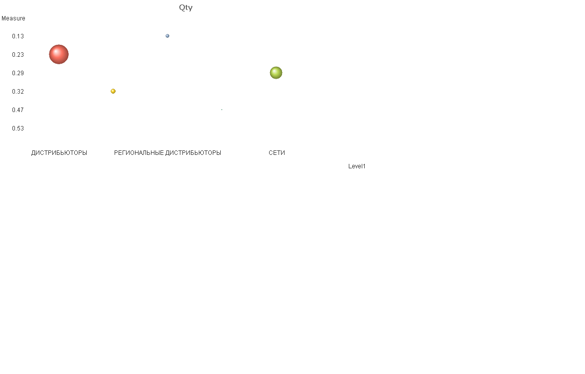
Guys,
I've made this chart with calculated dimension like Aggr(Avg(Measure, Step), Level1), but I need to make a universal chart with drill down option from Level1 to Level3 or even to Product Groups.
Any ideas?