Unlock a world of possibilities! Login now and discover the exclusive benefits awaiting you.
- Qlik Community
- :
- All Forums
- :
- QlikView App Dev
- :
- Highlighting Min and Max on the Line chart
- Subscribe to RSS Feed
- Mark Topic as New
- Mark Topic as Read
- Float this Topic for Current User
- Bookmark
- Subscribe
- Mute
- Printer Friendly Page
- Mark as New
- Bookmark
- Subscribe
- Mute
- Subscribe to RSS Feed
- Permalink
- Report Inappropriate Content
Highlighting Min and Max on the Line chart
I may be missing something, but I was not able to find an option to highlight the Min and Max value on regular Line Chart. It exists by default on Mini Chart (attached), but I would need to do the same presentation on the regular chart as well.
Any suggestions?
Best regards,
Vladimir

- Tags:
- line_chart_min_max
- « Previous Replies
-
- 1
- 2
- Next Replies »
- Mark as New
- Bookmark
- Subscribe
- Mute
- Subscribe to RSS Feed
- Permalink
- Report Inappropriate Content
I do not have any problem with 100 and over number of points on the chart. Both Min and Max are displayed.
What kind of issues do you have?
Regards,
VK
- Mark as New
- Bookmark
- Subscribe
- Mute
- Subscribe to RSS Feed
- Permalink
- Report Inappropriate Content
Hi,
OK trying a real world example with a horrendously long Aggr expression and toggle between charts states I had, I thought I'd try this to simplify later understandability of my particular expression.
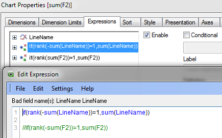
Copying the entire formula into your Rank expression works a treat, however using the simplified approach of the label doesnt work for me. Can you share a worked example. e.g. if I just try the same idea with the QVW example in this thread and adapt it by labelling the line as LineName, I did this which isnt working. What am I missing? Thanks
Also not sure if its a curveball but in my realworld application my toggle state label names have a space between them - e.g. they look like 'Line Name' so would this be an issue, if so is there a workaround to support multiple word label names.
- Mark as New
- Bookmark
- Subscribe
- Mute
- Subscribe to RSS Feed
- Permalink
- Report Inappropriate Content
How can you pull this off if you have 2 dimensions, such as Provider and Reporting Period, and then just 1 expression? I'd like to show the min and max dots for each provider over the time period I have selected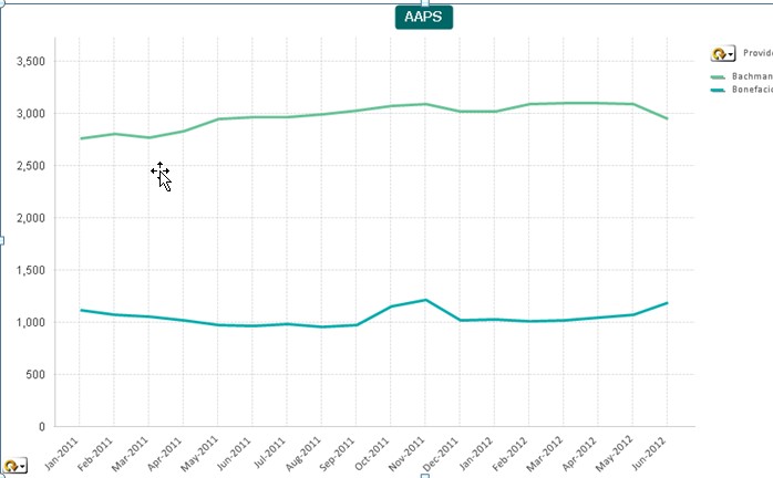
- Mark as New
- Bookmark
- Subscribe
- Mute
- Subscribe to RSS Feed
- Permalink
- Report Inappropriate Content
Hi John
This is a great solution which is working for me. Is it possible to plot the data values along with the Max and Min symbols?
Phil
- « Previous Replies
-
- 1
- 2
- Next Replies »