Unlock a world of possibilities! Login now and discover the exclusive benefits awaiting you.
- Qlik Community
- :
- All Forums
- :
- QlikView App Dev
- :
- How can I show multiple bar charts as a single sta...
- Subscribe to RSS Feed
- Mark Topic as New
- Mark Topic as Read
- Float this Topic for Current User
- Bookmark
- Subscribe
- Mute
- Printer Friendly Page
- Mark as New
- Bookmark
- Subscribe
- Mute
- Subscribe to RSS Feed
- Permalink
- Report Inappropriate Content
How can I show multiple bar charts as a single stacked chart?
Hi there,
I have some data that I'm trying to display in a single bar chart instead of several separate ones. Really hoping someone can help 
Data
My data looks like this:
| Country | Internet | Text | Video | |
|---|---|---|---|---|
| UK | 1 | 1 | 1 | 5 |
| USA | 2 | 2 | 2 | 4 |
| India | 3 | 3 | 1 | 1 |
| UK | 2 | 3 | 1 | 2 |
| UK | 6 | 4 | 3 | 3 |
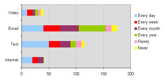
The numbers in the columns Internet, Text, Email and Video represent the frequency that people use these media types.
- 1 = every day
- 2 = every week
- 3 = every month
- 4 = every year
- 5 = rarely
- 6 = never
I would like to display the results of this table in a stacked chart as follows:
Would also like to create a list box that allows me to filter by country.
Any help to acheive this would be much appreciated!
Many thanks,
Katie
Accepted Solutions
- Mark as New
- Bookmark
- Subscribe
- Mute
- Subscribe to RSS Feed
- Permalink
- Report Inappropriate Content
Hi Katie
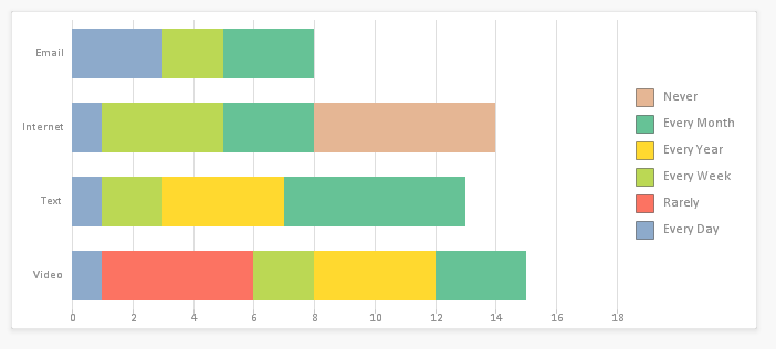
Please find the attachment. Hope this gives you an idea. This is just rough, You can enhance on your requiremen,t
- Mark as New
- Bookmark
- Subscribe
- Mute
- Subscribe to RSS Feed
- Permalink
- Report Inappropriate Content
Hi Katie
Please find the attachment. Hope this gives you an idea. This is just rough, You can enhance on your requiremen,t
- Mark as New
- Bookmark
- Subscribe
- Mute
- Subscribe to RSS Feed
- Permalink
- Report Inappropriate Content
Is this what you are looking for?
---------------------------------------------------------------------------------------------
OrgTable:
LOAD
INLINE [
Country, Internet, Text, Email, Video
UK, 1, 1, 1, 5
USA,2, 2, 2, 4
India, 3, 3, 1, 1
UK, 2, 3, 1, 2
UK, 6, 4, 3, 3
]
;
NewTable:
CrossTable (Type,Value , 1)
LOAD *
RESIDENT OrgTable;
DROP TABLE OrgTable;
----------------------------------------------------------------------------------------------------------
Create calculated dimension containing a set of if then statements for the groupings.
=
if(Value = 1, 'Every Day',
if(Value = 2, 'Every Week',
if(Value = 3, 'Every Month',
if(Value = 4, 'Every Year',
if(Value = 5, 'Rarely',
if(Value
= 6, 'Never')
)
)
)
)
)
- Mark as New
- Bookmark
- Subscribe
- Mute
- Subscribe to RSS Feed
- Permalink
- Report Inappropriate Content
Thanks so much for this - it works perfectly! 
- Mark as New
- Bookmark
- Subscribe
- Mute
- Subscribe to RSS Feed
- Permalink
- Report Inappropriate Content
Thank you dibblemc - I used KStreak S's answer first and it worked really well, although I did find your reply really helpful