Unlock a world of possibilities! Login now and discover the exclusive benefits awaiting you.
- Qlik Community
- :
- All Forums
- :
- QlikView App Dev
- :
- How have a list of similar products ordered by cus...
- Subscribe to RSS Feed
- Mark Topic as New
- Mark Topic as Read
- Float this Topic for Current User
- Bookmark
- Subscribe
- Mute
- Printer Friendly Page
- Mark as New
- Bookmark
- Subscribe
- Mute
- Subscribe to RSS Feed
- Permalink
- Report Inappropriate Content
How have a list of similar products ordered by customers
Hello all
Beginer in Qlik.
I have a table of customers and i want to display only the similar products they ordered ?
My Data :
| Products | Customers | Qte |
| A | yves | 2 |
| A | polo | 2 |
| A | jean | 2 |
| A | yves | 1 |
| B | yves | 1 |
| B | yves | 1 |
| B | jean | 1 |
| B | jean | 1 |
| B | jean | 1 |
| B | polo | 1 |
| C | jean | 2 |
| C | jean | 2 |
what i want when i choose My customers?
| Products | Qte |
| A | 7 |
| B | 6 |
How can i do that? Thank you for your responses
François
Accepted Solutions
- Mark as New
- Bookmark
- Subscribe
- Mute
- Subscribe to RSS Feed
- Permalink
- Report Inappropriate Content
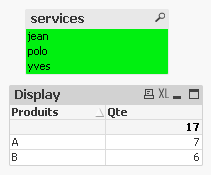
Answer is here !!!
Creating a simple chart type chart
Adding the Products dimension
Added Display expression: If (count (DISTINCT services) = GetPossibleCount (services), 1, 0)
Added Qte expression: Display * sum (Qte)
On the Presentation tab, select the Display column and select "Hide Column"
You have your result:
if you want sparkline
do this :
Remove Dimension Products
Add the following calculated dimension:
= Aggr (If (count (DISTINCT services) = GetPossibleCount (services), Products, Null ()), Products)
Remove Display
Change the expression Qte: sum (Qte)
Add your expression sum (Qte) which you will display in sparkline with the week dimension
- Mark as New
- Bookmark
- Subscribe
- Mute
- Subscribe to RSS Feed
- Permalink
- Report Inappropriate Content
You could use for this a table-chart or also a bar/line-chart with Products as dimension and sum((Qte) as expression.
- Marcus
- Mark as New
- Bookmark
- Subscribe
- Mute
- Subscribe to RSS Feed
- Permalink
- Report Inappropriate Content
Hi find the attached one
if suits you make it as correct answer
- Mark as New
- Bookmark
- Subscribe
- Mute
- Subscribe to RSS Feed
- Permalink
- Report Inappropriate Content
take Product in dimension and sum of Qte in expression to get your desired result.
sum(Qte)
- Mark as New
- Bookmark
- Subscribe
- Mute
- Subscribe to RSS Feed
- Permalink
- Report Inappropriate Content
can do that in a table chart I guess. !
- Mark as New
- Bookmark
- Subscribe
- Mute
- Subscribe to RSS Feed
- Permalink
- Report Inappropriate Content
Thanks for you'r reply
but that give me all the product not only the products that are mutual for
- Mark as New
- Bookmark
- Subscribe
- Mute
- Subscribe to RSS Feed
- Permalink
- Report Inappropriate Content
Thank you but i have the free edition
i can't open you're test .
Sorry
- Mark as New
- Bookmark
- Subscribe
- Mute
- Subscribe to RSS Feed
- Permalink
- Report Inappropriate Content
Answer is here !!!
Creating a simple chart type chart
Adding the Products dimension
Added Display expression: If (count (DISTINCT services) = GetPossibleCount (services), 1, 0)
Added Qte expression: Display * sum (Qte)
On the Presentation tab, select the Display column and select "Hide Column"
You have your result:
if you want sparkline
do this :
Remove Dimension Products
Add the following calculated dimension:
= Aggr (If (count (DISTINCT services) = GetPossibleCount (services), Products, Null ()), Products)
Remove Display
Change the expression Qte: sum (Qte)
Add your expression sum (Qte) which you will display in sparkline with the week dimension