Unlock a world of possibilities! Login now and discover the exclusive benefits awaiting you.
- Qlik Community
- :
- All Forums
- :
- QlikView App Dev
- :
- How to change font colors on charts
- Subscribe to RSS Feed
- Mark Topic as New
- Mark Topic as Read
- Float this Topic for Current User
- Bookmark
- Subscribe
- Mute
- Printer Friendly Page
- Mark as New
- Bookmark
- Subscribe
- Mute
- Subscribe to RSS Feed
- Permalink
- Report Inappropriate Content
How to change font colors on charts
Hello again,
I have another question regarding data values on charts. this is how it looks like and it is a bit hard to see. How can i make them bold?
I am talking about the number below the graphs? They are really hard to see.
or darker? 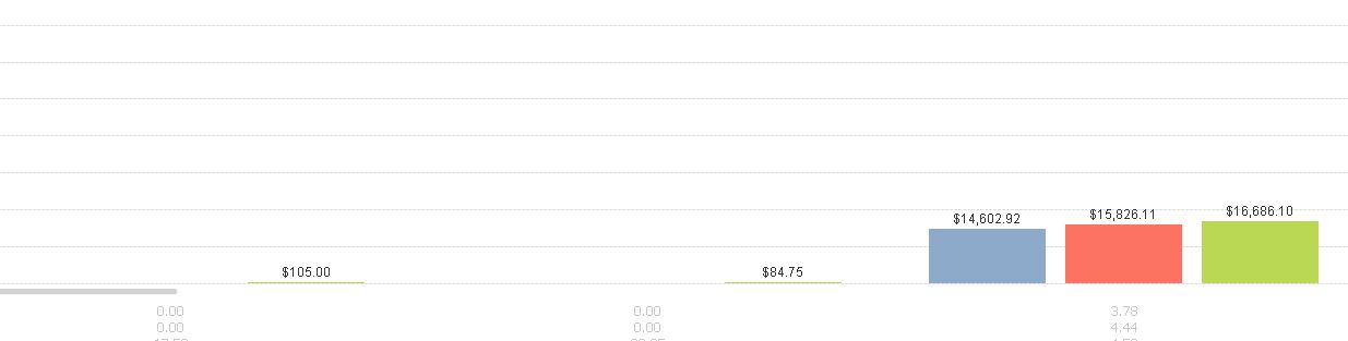
Accepted Solutions
- Mark as New
- Bookmark
- Subscribe
- Mute
- Subscribe to RSS Feed
- Permalink
- Report Inappropriate Content
In Chart properties go to Axis Tab and select Axis Color in left lower corner, choose bold.
- Mark as New
- Bookmark
- Subscribe
- Mute
- Subscribe to RSS Feed
- Permalink
- Report Inappropriate Content
For the "Values On Data Points" you can set the Text Format property = '<B>' in the Expression.
For the values on axis, go to the Axes tab, and click on "Font..." button inside the "Dimension Axis" box. Or select the Expression on the Expression Axes and change the font configuration.
- Mark as New
- Bookmark
- Subscribe
- Mute
- Subscribe to RSS Feed
- Permalink
- Report Inappropriate Content
In Chart properties go to Axis Tab and select Axis Color in left lower corner, choose bold.
- Mark as New
- Bookmark
- Subscribe
- Mute
- Subscribe to RSS Feed
- Permalink
- Report Inappropriate Content
Guilherme,
Where do I find those expressions for other possible options?
- Mark as New
- Bookmark
- Subscribe
- Mute
- Subscribe to RSS Feed
- Permalink
- Report Inappropriate Content
Got from Qlikview Help:
Text Format
Edit the Text Format expression to enter an attribute expression for calculating the font style of text associated with the data point (For tables: text in the table cell for each dimension cell. The calculated text format will have precedence over table style defined in the Chart Properties: Style.) The expression used as text format expression should return a string containing a '<B>' for bold text, '<I>' for italic text and/or '<U>' for underlined text. Note that = is necessary before the string.