Unlock a world of possibilities! Login now and discover the exclusive benefits awaiting you.
- Qlik Community
- :
- All Forums
- :
- QlikView App Dev
- :
- How to color weekends in a date dimension to disti...
- Subscribe to RSS Feed
- Mark Topic as New
- Mark Topic as Read
- Float this Topic for Current User
- Bookmark
- Subscribe
- Mute
- Printer Friendly Page
- Mark as New
- Bookmark
- Subscribe
- Mute
- Subscribe to RSS Feed
- Permalink
- Report Inappropriate Content
How to color weekends in a date dimension to distinguish them from weekdays
Hello QlikView-Community,
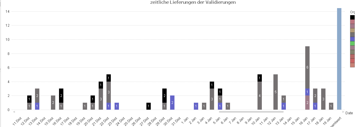
i have a bar-chart, where the dimension of the x-axis is a date:

Now i want to have a visiual aid to distinguish weekdays from weekends in the x-axis by for example coloring weekends red and weekdays green.
Till now i have only figured out, that i can color the x.axis in the tab axis and clicking font for the dimensionaxis. There i can chose the color even by a function, but the function is not workin as i want it. So the outcome is that all values have the same color, which doesnt help to distinguish the weekdays from weekends.
Does anybody know how to color the weekends?
Thanks in advance.
Best greetings.
Mila
- Mark as New
- Bookmark
- Subscribe
- Mute
- Subscribe to RSS Feed
- Permalink
- Report Inappropriate Content
Have a look at this sample app...
Check out the background property in the expression in the chart
- Mark as New
- Bookmark
- Subscribe
- Mute
- Subscribe to RSS Feed
- Permalink
- Report Inappropriate Content
Thanks for the fast answer. I actually meant to color the values of the date dimension like'1 Jan' or '22 feb' and not to color the values of the function. Do you have an idea how to do this?
Best greetings
Mila
- Mark as New
- Bookmark
- Subscribe
- Mute
- Subscribe to RSS Feed
- Permalink
- Report Inappropriate Content
Hi,
I think its not possible in bar chart.
If it is a pivot or straight table you can go by click the expand icon of the Dimension and Entering Text color as
=if(WeekDay(date)>4,red(),green())
Hope it helps
Celambarasan
- Mark as New
- Bookmark
- Subscribe
- Mute
- Subscribe to RSS Feed
- Permalink
- Report Inappropriate Content
Hi
Hope this attached file will be helpful for your requirement.
Here the weekends Sat and Sun is one color and other weekend days from mon to fri is one color
Check it,
Regards