Unlock a world of possibilities! Login now and discover the exclusive benefits awaiting you.
- Qlik Community
- :
- All Forums
- :
- QlikView App Dev
- :
- How to create a pareto chart from both x and y dim...
- Subscribe to RSS Feed
- Mark Topic as New
- Mark Topic as Read
- Float this Topic for Current User
- Bookmark
- Subscribe
- Mute
- Printer Friendly Page
- Mark as New
- Bookmark
- Subscribe
- Mute
- Subscribe to RSS Feed
- Permalink
- Report Inappropriate Content
How to create a pareto chart from both x and y dimension
Hi Friends
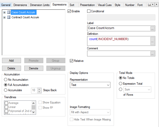
I have a simple table with simple calculation. i did not use function to do running sum and get the percentages of total. just use the default accum, relative option in building a chart.
basically, we have contract, and customer using contract to open cases. i use the contract as dimension, sorted by descending of how many cases are opened on that contract.
check the Full Accumulation and Relative, got the table i needed, see the detail setting below
the table i got look like this:
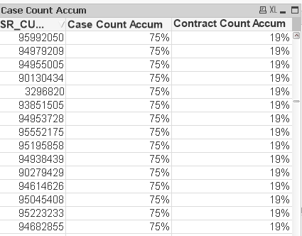
you can see 19% of contract created 75% cases. like common 20-80 scenario!
now my question is how can i turn the number in the Case Count Accum and Contract Accum into a line chart like a pareto chart...
Best Regards,
- Mark as New
- Bookmark
- Subscribe
- Mute
- Subscribe to RSS Feed
- Permalink
- Report Inappropriate Content