Unlock a world of possibilities! Login now and discover the exclusive benefits awaiting you.
- Qlik Community
- :
- All Forums
- :
- QlikView App Dev
- :
- How to create the below chart
- Subscribe to RSS Feed
- Mark Topic as New
- Mark Topic as Read
- Float this Topic for Current User
- Bookmark
- Subscribe
- Mute
- Printer Friendly Page
- Mark as New
- Bookmark
- Subscribe
- Mute
- Subscribe to RSS Feed
- Permalink
- Report Inappropriate Content
How to create the below chart
Hi all,
I wish to create a chart like below
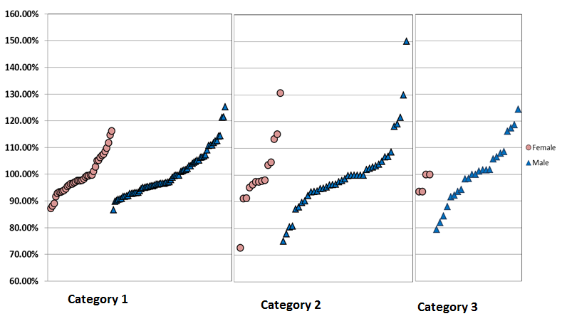
Here each point represent the score for each employee. Each category contains 20-30 employees at least. Initially I created a Combo chart with the trellis option enabled for Category field but as trellis can not show scrollbar all the employee points shown in the chart got cut. I am fine with creating three separate charts for each category but still showing the closely stacked list of points for each employee within the category is a challenge. Does anybody has a solution to it? Thanks in Advance
- Mark as New
- Bookmark
- Subscribe
- Mute
- Subscribe to RSS Feed
- Permalink
- Report Inappropriate Content
Amar,
Check Trends , relationship tab in the attachment.
Thanks,
AS
- Mark as New
- Bookmark
- Subscribe
- Mute
- Subscribe to RSS Feed
- Permalink
- Report Inappropriate Content
Sorry amit, In the chart shown above the circles represent the Men Employee Numbers and Triangles represent the Female Employee Numbers. The legends are hidden. Can anybody suggest something????
- Mark as New
- Bookmark
- Subscribe
- Mute
- Subscribe to RSS Feed
- Permalink
- Report Inappropriate Content
Hi,
like this see attached
Regards
André Gomes