Unlock a world of possibilities! Login now and discover the exclusive benefits awaiting you.
- Qlik Community
- :
- All Forums
- :
- QlikView App Dev
- :
- How to get rid of a legend only in the z-Axis (3D-...
- Subscribe to RSS Feed
- Mark Topic as New
- Mark Topic as Read
- Float this Topic for Current User
- Bookmark
- Subscribe
- Mute
- Printer Friendly Page
- Mark as New
- Bookmark
- Subscribe
- Mute
- Subscribe to RSS Feed
- Permalink
- Report Inappropriate Content
How to get rid of a legend only in the z-Axis (3D-plot)
Hello everyone,
we got a 3D plot. Unfortunately, while we are happy with the y-axis legend, the z-axis legend is really messy, clustered, takes a lot of space and basically it is not needed.
Here you can see an image:
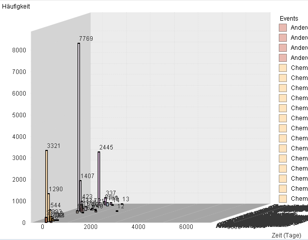
As you can see in the bottom right, everything is overlapping and unreadable. The thing is we do not need that legend at this postion at all. What we need are the labels to the right (y-axis) but z-axis labels are completly superflous.
Has anyone an idea of we can get rid of ONLY the z-axis labels. Thanks in regards!
- Mark as New
- Bookmark
- Subscribe
- Mute
- Subscribe to RSS Feed
- Permalink
- Report Inappropriate Content
Yay for 3D chartjunk. Try a simple 2D bar chart with either grouped or stacked bars. And leave out the values on top of the bars. If those exact values are that important then you should use a table where they can be read clearly.
talk is cheap, supply exceeds demand
- Mark as New
- Bookmark
- Subscribe
- Mute
- Subscribe to RSS Feed
- Permalink
- Report Inappropriate Content
Dear Gysbert,
we already also have a 2D chart but included an option for 3D since we have different events which occure after exactly the same amount of days, or they are close to each other, and therefore the overlap. We dont think a stacked 2D chart therefore is a real option. So is there really no other way to remove the z-axis labels?
Cheers,
Daniel
- Mark as New
- Bookmark
- Subscribe
- Mute
- Subscribe to RSS Feed
- Permalink
- Report Inappropriate Content
Disable the Show Legend option of the z-axis dimension.
talk is cheap, supply exceeds demand