Unlock a world of possibilities! Login now and discover the exclusive benefits awaiting you.
- Qlik Community
- :
- All Forums
- :
- QlikView App Dev
- :
- How to make my sales Tab able to tell a story ?
- Subscribe to RSS Feed
- Mark Topic as New
- Mark Topic as Read
- Float this Topic for Current User
- Bookmark
- Subscribe
- Mute
- Printer Friendly Page
- Mark as New
- Bookmark
- Subscribe
- Mute
- Subscribe to RSS Feed
- Permalink
- Report Inappropriate Content
How to make my sales Tab able to tell a story ?
Hi All
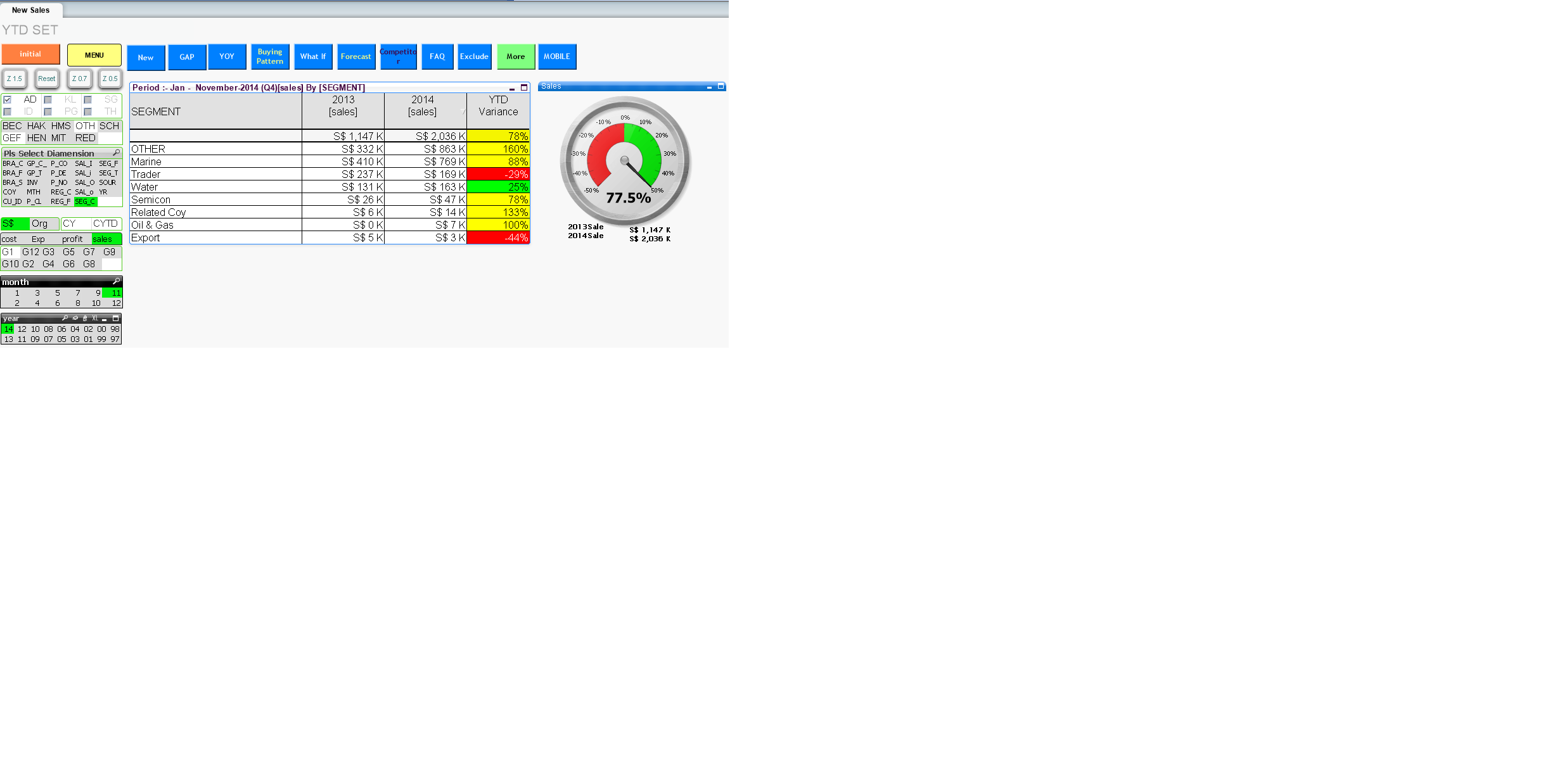
I want to make my page to be able to tell a story. so i add the gauge chart which indicate the overall sales change on the right side of the Table. ( My org tab with out gauge chart ). My Question are :-
1. what other information i can add in order to make my story more interesting ?
2. Instead of the gauge chart , what other chart can replace it , to make it easy for user understand better.
3. By adding a gauge chart , does it make sense ? since the table first row already display % change.
4. Any other suggestion will be appreciated.
- Mark as New
- Bookmark
- Subscribe
- Mute
- Subscribe to RSS Feed
- Permalink
- Report Inappropriate Content
Hi All
Many hv read my post. But none hv give comment.
Since story telling for data presentation is impt. Hope some one can share
Paul