Unlock a world of possibilities! Login now and discover the exclusive benefits awaiting you.
- Qlik Community
- :
- All Forums
- :
- QlikView App Dev
- :
- How to plot line chart with two different dimensio...
- Subscribe to RSS Feed
- Mark Topic as New
- Mark Topic as Read
- Float this Topic for Current User
- Bookmark
- Subscribe
- Mute
- Printer Friendly Page
- Mark as New
- Bookmark
- Subscribe
- Mute
- Subscribe to RSS Feed
- Permalink
- Report Inappropriate Content
How to plot line chart with two different dimensions and single expression
Hi everyone,
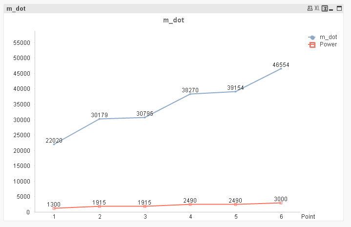
I have a table below as shown.
| ID# | Section | Point | RPM | m_dot | Power |
| 1 | 1 | 1 | 5620 | 22020 | 1300 |
| 1 | 1 | 2 | 5620 | 30179 | 1915 |
| 1 | 1 | 3 | 5620 | 30795 | 1915 |
| 1 | 1 | 4 | 5620 | 38270 | 2490 |
| 1 | 1 | 5 | 5620 | 39154 | 2490 |
| 1 | 1 | 6 | 5620 | 46554 | 3000 |
I want to plot the above table in Line chart showing Power on X-axis and m_dot on Y-axis. When I plot the graph its taking the Power 1915 which has m_dot of 30179 & 30795 values. But its plotting single point on 1915 with power and m_dot to be average of both values as 30487. Similar case with 2490 as Power.
I simply want all Power plots and m_dot to be plotted on line chart.
Can anyone help me with this !!
Thanks !!
Rajender
- « Previous Replies
-
- 1
- 2
- Next Replies »
- Mark as New
- Bookmark
- Subscribe
- Mute
- Subscribe to RSS Feed
- Permalink
- Report Inappropriate Content
Other way is to move Power to measure/expressions and you will get something below.And you also change chart type to see correct values also in straight table.See attached qvw
- Mark as New
- Bookmark
- Subscribe
- Mute
- Subscribe to RSS Feed
- Permalink
- Report Inappropriate Content
No Chai. Bcoz I am plotting to check power against m_dot to check the values with other chart. So it doesn't work in my requirement.
- « Previous Replies
-
- 1
- 2
- Next Replies »